The scene of 1833 shown here is a copy of an engraving by Adolf Vollmy. Estimates ranged from a few tens of thousands of meteors per hour over a hundred thousand per hour. One of the quotes I read from eyewitnesses said “never did rain fall much thicker than the meteors fell toward the earth.”
My own church (Seventh-day Adventist) believes that event to have been the fulfillment of what Jesus said in Matthew 24:29, “and the stars shall fall from heaven,” (excerpt) as one of the signs that His second coming is drawing near. The symbolism here becomes apparent when considering that the point of origin for the Leonids is the constellation Leo, the lion, and specifically from the asterism called the Sickle, which is a group of stars that forms a part of Leo. Jesus is referred to in the Bible as the “Lion of the tribe of Judah” and is said to return with a sickle in His hand to reap the harvest of the Earth. The sky that night was so thick with meteors that it was obvious to everyone they were radiating out from the sickle, even if seen from different geographic locations, and thus astronomy learned that meteors are indeed in space and not just an atmospheric phenomenon as people thought before.
Before that, in the same verse, it’s stated that “immediately after the tribulation of those days shall the sun be darkened, and the moon shall not give her light…” which we believe was fulfilled in the dark day of 1780 (Wikipedia link). The tribulation referred to would be the persecution of Protestants, which was greatly declining from 1724 onward.
I first started this by shading some general shapes with a stick of water-soluble graphite. Then I painted over that with a transparent mix of clear acrylic gesso and an acrylic medium, which wetted the graphite and gave a silvery dark grey base to build on top of. The acrylic mediums also sealed the graphite from smudging further and provided a textured surface to draw on top of. I started working a little with black and white charcoal, but eventually settled on just using various mixes of zinc or titanium white with acrylic mediums to build up transparent layers of white. For areas that needed to be darkened again I either repeated the first step with the graphite or shaved off pieces of graphite to be mixed with acrylic medium to make a dark paint.
If you have any questions on any of this, feel free to ask.
Egg tempera on heavy watercolor paper, 6.5″ x 4.75″
Today I tried making egg tempera paint for the first time. The binder is just an egg yolk, completely separated from everything else, and to prevent mold a small amount of 70% rubbing alcohol was mixed in. I made five paints- lemon ochre, Venetian red, Nicosia green earth, ultramarine blue, and titanium white. Except for the white all of the pigments were from Natural Pigments.
The paint was very nice to work with, but tended to form a dry skin over it on the palette very quickly and things got a little rushed in an effort to finish the painting adequately before running out of useable paint.
Water-soluble encaustic on bristol board, 8″ x 6.75″
More practice with Ceracolors paint, using the same limited palette of yellow ochre, mars red, and titanium white, as well as ultramarine and mars black that I made using the Ceracolors fluid medium. The titanium white really isn’t as opaque in this medium as you’d expect. It takes a little getting used to using a paint in a way similar to oil paint but without an opaque white.
Watercolor and graphite on 140 lb watercolor paper, 5″ x 8″
The paints are all from M Graham. The most used were cobalt green, azo yellow, and tartan blue (an old limited edition cerulean). Cobalt violet was also used with the yellow to produce the browns, and a small amount of cobalt teal for the sky. So two blues and one each of green, yellow, and violet.
I tried to use stronger colors than the original by Francis Towne, which looks dull and washed out to me, but I started too strong at the top and didn’t end up with the full range needed for atmospheric perspective. So the original actually has a stronger sense of depth. Also the cobalts, which naturally granulate, gave this copy a lot more texture than the original.
This is painted with Ceracolors wax paint on heavy weight watercolor paper, primed with a mix of acrylic gesso and white acrylic paint to reduce the absorbency. It’s actually on the back of an unsuccessful watercolor painting. The palette is just yellow ochre, mars red, ultramarine, mars black, and titanium white.
Normally I don’t put enough effort into modeling the branches of trees or making them naturalistic, so I thought it would be beneficial to practice a little while using a reference as a guide. This was also a good chance to practice using gouache in a more opaque way as the highlights on the leaves were built up. Gouache can be used very similar to watercolor, which is what I tend do during the rare times that I use it, but layering denser applications of opaque paint isn’t something watercolor can do.
If you’re using a low resolution screen the details might be hard to see, so there’s a larger view of this painting here- full size
Vieille Fabrique sur la Somme, after Frits Thaulow Water-soluble encaustic on bristol board, 4″ x 2.75″
In part 1, seen here, I started trying out the Ceracolors water-soluble encaustic paint sampler set from Natural Pigments. The palette for all of the paintings in this post is the original sampler set of yellow ochre, mars red, and titanium white, plus ultramarine blue and mars black made using the fluid medium that came with the set and some dry pigment.
Previously, there was difficulty getting dark shadows using the original palette and ultramarine. That started becoming a problem again during this painting, so part way through I made the mars black paint that I’m now storing in a small glass bottle. That one palette addition was very helpful in all of these paintings.
The difficulty of mixing dark colors with this palette seems partly because this medium dries very matte, which can be great in some ways but takes a lot of the depth out of dark colors. Another factor is that different binders affect how colors look and the ultramarine dries much lighter than it would in oil paint. Lastly, high opacity paints such as mars red hinder mixing dark colors, regardless of medium.
A Snowy Harbor View, after Frits Thaulow Water-soluble encaustic on bristol board, 2.5″ x 2.75″
Early on some of the placements of buildings here were off, but I decided to just continue as it is. The overall colors here are also much cooler than the original. I typically mix my colors on a painting more than on a palette, but this paint dries quickly unless the fluid medium is used and I ended up doing all my mixing on the palette. That was the main aspect of this paint that I found challenging.
Autumn Sunset 1908, after Robert Julian Onderdonk Water-soluble encaustic on bristol board, 4.75″ x 2″
I tried breaking the paint a little with dry brushing to get the effect of reflections in the water. Matching the colors in the sky was difficult using only earths, but it worked out well enough.
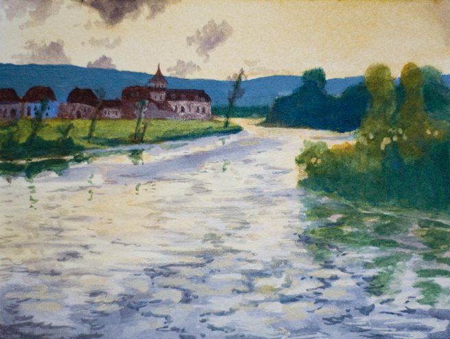
Oyat River, after Vasily Polenov Water-soluble encaustic on bristol board, 3.25″ x 2.25″
Getting sufficient chroma for the bright yellow greens of the sunlit grass was a challenge for this limited palette. I got close to the results I wanted by painting the sunlit grass a very light pale green mix, letting it dry, and then glazing (or more correctly, scumbling, because it’s not fully transparent) over it with a semi-transparent mix of yellow ochre, ultramarine, and fluid medium. Glazing transparent paint over a light ground produces more chromatic results than simply adding white to lighten the paint to the same degree. Because the paint dries quickly this only took a few moments to do, and because it doesn’t easily rewet once dry I didn’t need to worry about accidental mixing as I glazed. It wasn’t perfect though because the paint tends to dry opaque and hold brush strokes more than gouache, so the glaze wasn’t very smooth or transparent. It got the results needed well enough even though it’s really only barely green. A dedicated green paint or a higher chroma yellow would have been a big improvement to the palette in this landscape.
At the Foot of Mount Hermon 1882, after Vasily Polenov Water-soluble encaustic on bristol board, 3.25″ x 2.25″
The fast drying nature of Ceracolors combined with the opacity of most of the paints in this palette made it fast and easy to paint in general shapes first and then paint details over top of that. For this last painting I made four solid shapes for the sky, background, midground, and foreground, then added the details on top. Using these outdoors for plein air painting may be a good strategy to try next.
Granted these practice paintings are small, but I’ve actually used very little paint, so this sampler set is something I can keep practicing with for a good long time. Some paints will last longer than others though. I’ve definitely used much more of the titanium white than any other paint and I should probably save the rest of the fluid medium for when I’ll need to make more of that. The mars red is the opposite. I don’t use red much anyways, and mars red is a very strong tinting paint, so only a small amount of it is needed. It’s already obvious there’ll still be a significant amount of mars red left after the other paints are all used up.
Using just the original paints the palette of the sampler set is very limited but provides plenty of paint to use and decide whether you’d want to buy more of it. Maybe using smaller tubes to allow for a larger range of colors in the set at about the same price, or even a little more, would have greatly increased the usability of the set, but as it is it’s a very good deal and very good paint.
Something useful about the caps is that they each have a little swatch of paint on top of the cap so the paints can be easily identified. Unfortunately, the caps of two of the original three tubes have cracked in such a way that the top is splitting off from the part than screws onto the tube’s threads. I’ve had many caps crack in various ways from many other brands in both oil and watercolor paint, so this is something that happens. However, this is normally a rare thing and here it’s happened to two out of three tubes in a short time, so I thought I should mention that.
I’ve really enjoyed using Ceracolors so far and I’ll keep using them. If I wasn’t on a break from buying new art supplies then I’d get some more, but what I have should last awhile. Next time I’ll paint something larger and experiment with actually applying heat to the dried paint to see how well it can be reworked once melted.
Zinaida Dove, after John James Audubon
Mixed media on bristol board, 6″ x 4″
Last night I was browsing the blogs Create art everyday and Myr’s Bytes and noticed that today would be draw a bird day, and as you can see they already have theirs posted. Apparently the present bird hub is on Method two madness.
This is copy of part of an illustration by John James Audubon, original seen here. The beginning line work was done with a 7H pencil, followed by Daniel Smith walnut ink applied with a brush. Then the solid black areas were mostly drawn with a fine black felt tip pen but some of it was done with a brush pen. The part that took much longer than expected was adding the details of the feathers and some grey areas with a black colored pencil. I lightened the bird’s back by partially erasing the colored pencil, and the background is also colored pencil. A little white charcoal was used to add white lines on a couple of tail feathers that had too much ink.
This is Philip Melanchthon, a German reformer during the Protestant Reformation who co-labored along side Martin Luther. Luther was an outgoing preacher while Melanchthon was more of a gentle theologian. Among many other things, they preached justification through faith and salvation only through Christ by grace. Original painting here.
I’ve started practicing portraits and trying to work especially on flesh tones, which I’ve never been good at. The flesh colors here are transparent gold ochre, transparent red oxide, green earth, some tubed grey, and lots of zinc white and unbleached titanium white. I think the shading came out pretty well, but I didn’t get the subtle shifts of hue like in the original. The rest of the painting has some of those same paints plus raw umber, ivory black, ultramarine blue, and titanium white.
Also I’m trying to improve the resolution images are displayed here. If it worked right, people with high resolution screens have a clearer image without causing problems for other people. Let me know if it worked.
Lastly, it’s currently the first day of 2016 for me. I don’t normally do resolutions, but I made a few, and one of them is to be more frugal this year. With just a few exceptions I’ll try not to buy any new art supplies this entire year and instead make proper use of what I have on hand.
Copy of Bethlehem 1882 by Vasily Polenov (Васи́лий Дми́триевич Поле́нов)
Water-soluble encaustic on acrylic primed bristol board, 6.75″ x 3.5″
I’ve been practicing with the sampler set of Ceracolors, a water-soluble encaustic (wax based) paint from Natural Pigments. Above is a copy of a painting from a Russian artist who made many New Testament paintings during the late 1800s. This is actually the third painting I made.
My palette consisted of only an ultramarine blue that I made myself from the fluid medium that came with the set and some Rublev pigment, plus the yellow ochre, mars red, and titanium white that were all in the set. With only these colors I had a hard time with bright green, and nothing dark enough to be called black was possible. Still, I think this one came out fairly well. I’m all out of empty 15ml tubes now since I used the last one for the ultramarine, but if I had one more I’d either use it to make a dark black for shadows and easier grey shades or a lemon yellow for mixing green.
Copy of Lake Teberdinsky, Caucasus by Nikolai Yaroshenko (Никола́й Алекса́ндрович Яроше́нко)
Water-soluble encaustic on acrylic primed bristol board, 5″ x 2.75″
This is copied from a Ukrainian artist, though at the time he lived it was a part of Russia. This was the second painting and for this one it was critically important to have a blue. Other than the brightest areas of snow every millimeter of paint has blue mixed into it. I was surprised to see how intense the color of the ultramarine was. It seems very close to the color of the raw pigment. If the pigment is mixed with oil instead then it becomes darker and isn’t nearly this intense except in transparent glazes.
Copy of Autumn Birches, Central Park by Robert Julian Onderdonk
Water-soluble encaustic on acrylic primed bristol board, 4.5″ x 3.75″
The original painting for this one was made by an artist from Texas. Besides playing with the paint a little to see what it was like, this is the first actual painting I made with Ceracolors. At this point I hadn’t made the blue yet, so all I had was yellow ochre, mars red, and white. I let some of the black acrylic I had primed the paper with show through in places.
Here’s the paper pad I’m working on. The bottom center is just a test I was doing with mostly ultramarine blue and white. I’ll paint over that, so there’ll be five spaces to make little practice paintings for part 2. All three of the finished paintings were made with just one brush, a size 8 synthetic filbert from Escoda that imitates sable hair.
I didn’t used to think I’d actually try wax based paint, because normal encaustics require you to melt the wax with a source of heat and has to be used quickly before it hardens, but Ceracolors have been somehow formulated to be both water-soluble and able to be simply used out of a tube without any heat needed. Using a blow drier on it afterward is suppose to fuse the layers though. In some ways it works like acrylic, but I already like Ceracolors better. It dries fast but dried paint can be rehydrated even a short time after it’s dried and it seems easier to rinse out of a brush.
For someone like me who has dry pigments and likes to make paint it was very good to have the fluid medium in the set because I can make small amounts of many different colors to experiment with. For most other people I think maybe a tube of blue would have been more useful than the fluid medium, since the lack of blue in the sampler set causes most of the color wheel to become inaccessible and makes landscapes a little difficult. Still, the set was only $9.95. The paint seems to be very good so far and I’ve enjoyed practicing with it.


