Misty Crags

Misty Crags

Acrylic on mat board, 5″ x 7″

At first I was going to try painting something abstract, but early on the shapes were looking like objects and I developed it in that direction. The composition seems too off balanced to the left to me, but it was nice to try out acrylics again for the first time in a long while.

Right now I’m several hours into what’s suppose to be the biggest storm in this area in five years. So far it’s just a lot of rain, but later tonight is when the worst part of the storm will arrive.

Misty Morning

Misty Morning

Watercolor on paper, 5″ x 3.25″

I was trying to make a dark neutral yesterday with a mix of burnt sienna dark and a variety of cerulean blue. To test it out I made this sketch. The paint can be used darker than this, though it’s not quite dark enough to be black. The warmer color in the sky is a light wash of the unmixed burnt sienna dark glazed over a very thin wash of the mix.

Clouds, Mountains, Forests

I’m experimenting more with black watercolors, white, and composition, as well as some of my favorite subjects. I don’t normally use gouache, but I filled a pan in my palette with white and used it on some of these. It looks like I’ve painted and drawn a lot of things in black recently. Maybe I’ll change gears and focus on a different color now.

Verdant Mist

Verdant Mist

Mixed media, watercolor and acrylic on paper, 6″x9″

I had attempted to repaint the sketch from the last post larger, but it just wasn’t working out. Eventually I decided to paint in the remaining white areas with a dark grey to practice with abstraction, but then they looked like mountains and I decided to go with that. The acrylic paint I added was some white and black liquid airbrush formula from Golden and some white heavy body formula from Liquitex. There’s a few mistakes, but that’s okay because the whole thing was almost one big mistake.

Misty Waterfalls

Misty Waterfalls

Oil on Canvas, 8″ x 10″

This is the kind of place I’d like to go to. When I started this, as I often do, I wasn’t sure what I would make and just had some basic forms. This is the result of me exploring those forms.

It’s been too long since my last post, but it’s not like I haven’t been painting. I’m actually working on a challenge in this forum thread (I’m yellow_oxide) to make 30 paintings in 30 days for the month of June. I think I have about 20 of them done, most of them already posted there, and when they’re all done I’ll post them here all at once on June 30th.

Morning on the Seine

Morning on the Seine 2

Oil on canvas, 10″ x 8″

I made another painting based on Monet’s series on the Seine, such as this painting. This is yet another painting that I started a couple of months ago and then finally got around to finishing just a couple of days ago.

I don’t remember what colors I started making this with, but at the end I painted over everything transparently using lapis lazuli (natural ultramarine, Daniel Smith), lemon ochre (PY43, Williamsburg), and a lot of zinc white (PW4, Daniel Smith). Getting a good photo with accurate colors was hard, so I did some editing to this and maybe the colors are close. They’re still a bit off though.

I think that the paintings in this series by Monet are among my favorite paintings. I keep them in a folder on my computer, along with many other artworks, that I labeled ur-poems because it was the best term I could think of for them. Everything in that folder are things that, when I look at them, seem to me to be the closest representation of an ideal in my own artistic vision that I want to achieve.

Urland 2

Urland 2

Acrylic on canvas, 7″ x 5″

Ancient mountains veiled in mist.

I used two acrylic airbrush colors (carbon black and titanium white) from Golden with a paintbrush and also a tube of regular Golden acrylic (also carbon black). The airbrush colors come in bottles and are fluid like ink. This is my first time using them. The brush I used is called a “scrubber” and has very short and stiff bristles. It’s not the kind of brush you’d expect to use with a very fluid paint, but I liked the rawness of it.

Morning Mist

Morning Mist

Watercolor on paper, 3.5″ x 5.5″

I wanted to try something out to see if it’d work. First I covered this paper with a dark wash of indigo (PB66) from Dick Blick and then while it was still damp I started adding titanium white watercolor that I had made myself to it. I think it worked out well. It’s normally very uncommon to use white paint in watercolor, except possibly as a highlight in a reflection. Most watercolorist will only use the white of the paper as their white.

Speaking of paint I’ve made, earlier today I got my first package from Kremer Pigments. In it is zirconium yellow (PY159), red bole (some sort of red earth), chromite (some greenish earth I think), Victoria green (PG51, I think, no one seems to make this anymore), iron oxide black (PBk11, a bluish variety), ultramarine violet (PV15, a light reddish variety), eggshell white (made from crushed eggshells), and aluminum tri/di-stearate (used as a stabilizer in oil paint). It’s been awhile since I last posted any new paint I’ve made, but I have been trying out some stuff and getting more things. Maybe tomorrow I’ll make some more paint and post it…

Misty Night

Endless Dream

Oil on canvas, 5″ x 7″

I spent a long while thinking of what to title this, but I think this fits. Imagery of misty mountains stretching into the distance have always been a favorite of mine.

The two paints I used for this are slate black (PBk19, Williamsburg) and flake white hue (PW6 + PW4, Winsor & Newton). The slate is a good black. A little gritty, but very close to neutral and not overpowering.

Valley of Waterfalls and Mist

Valley of Mist

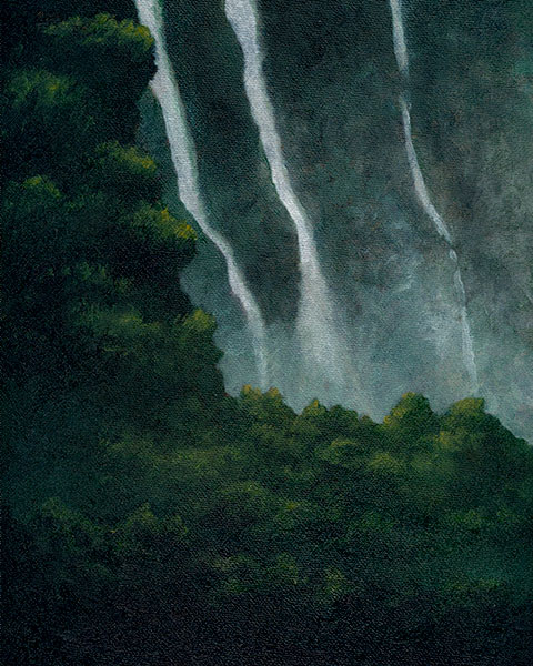
Oil on linen, 8″ x 6″

I think I may have once again painted my four favorite things- forest, mountains, mist, and waterfalls.

For this painting I used a 50/50 mix of French Cassel Earth (NBr8 natural bituminous earth, Williamsburg) and Viridian (PG18, M Graham) along with Flake White Hue (PW6+PW4, Winsor & Newton). Of all the paints in my collection the Cassel Earth that I recently got is one of the highlights for its uniqueness. The willingness of Williamsburg to make a non-mainstream paint like this that can’t just be gotten from a dozen other brands (Vasari is the only other brand that makes it) is one of my favorite things about them. It’s not completely lightfast (I’ve read that the brownishness turns grey over time) but it’s a transparent, gritty, blackish brown that feels very real and alive. When mixed with viridian, a semi transparent and cool shadowy green that’s possibly my favorite green, it becomes a highly transparent dull earthy green. Then mixed with white it becomes like jade.

The only brush I used was a Princeton synthetic filbert, 6300 series, size 2, and I didn’t wash it at any time while painting. I only worked with wet paint in two painting sessions during one day. You can see the scratches of the stiff bristles scrapping away some of the paint as I worked which left interesting textures.

I painted this on oil-primed linen that’s fixed to a wood panel, made by SourceTek. I’ve never used one of their products before, but I got this because it was discounted by 50% at the art store I was in and I thought I’d try it. It worked out well.

The colors in this photo might not be completely accurate because I took the photo outside in the shade, but I edited it a little to better match the real painting.