Limited Palette Paintings – Waterlilies and Sunset

Sunset in Winter Mountains
Winter Sunset, watercolor on paper, 7.25″ x 5.25″

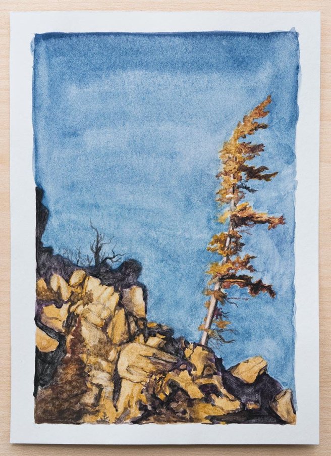
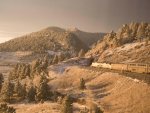
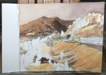
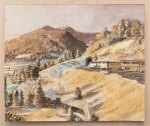
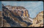
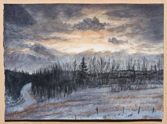
This past week I’ve been using a palette with a little more spring potential, with the inclusion of chromium oxide green, but I also wanted to paint some clouds too. This painting above is from a photo I took last winter in the Rocky Mountains.

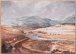
It was a snowy landscape with little light from the overcast sky late in the day, but then the clouds started to slowly part enough for sunlit clouds to be seen through them in a long rift. Thinking about it now reminds me of this quote I’ve read- “When Satan thrusts his threatenings upon you, turn from them, and comfort your soul with the promises of God. The cloud may be dark in itself, but when filled with the light of heaven, it turns to the brightness of gold; for the glory of God rests upon it.” -Ellen White

Waterlilies, watercolor on paper, 7″ x 5″

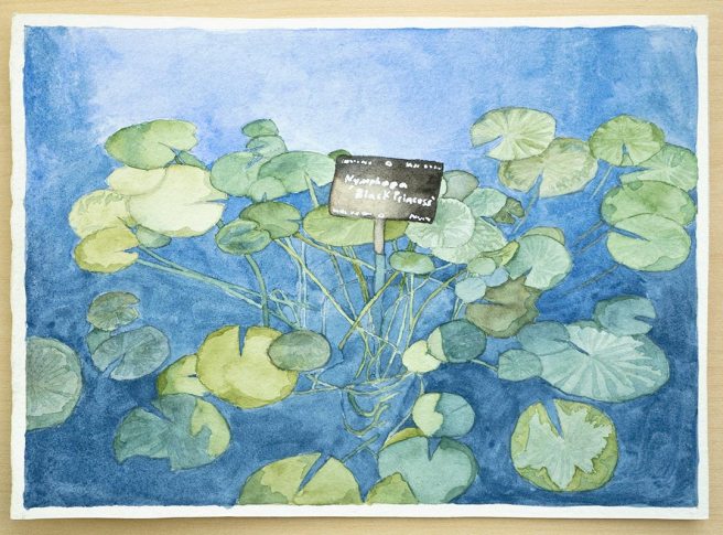
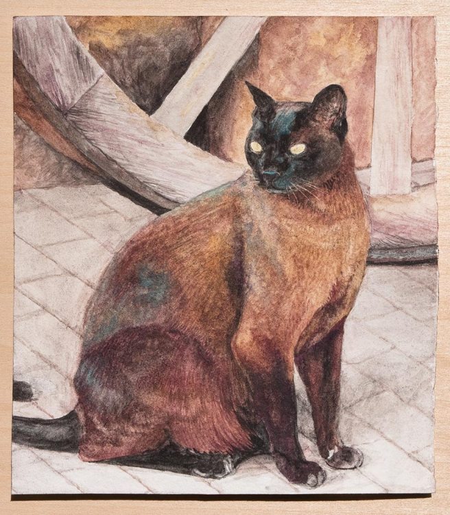
Because of the green on the palette I made sure to also paint some plants. This waterlily was painted from a photo I took at the Denver Botanic Gardens. It’s called Black Princess, and apparently has blackish red flowers when they’re blooming.

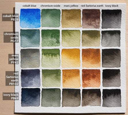
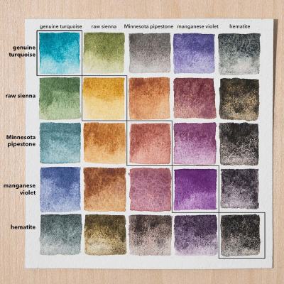
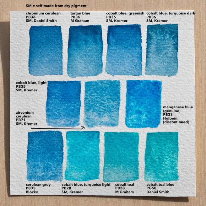
For the palette this week cobalt blue was a very good, strong blue, but granulated a little too much to get the smoothness of the water. It made nice greys when mixed with the red earth, which was otherwise not used much. The real stand out was the chromium oxide, which is the one that I made myself from dry pigment. It’s very strong and also opaque. About 12 of the 25 mixes above are green because so many of these are either green or combine to make green. Ivory black actually wasn’t used very much, except in the trees of the sunset painting, but I wanted the option of something darker than the grey made from mixing cobalt blue and the red earth.

Limited Palette Paintings – Cat and Tree

Siamese Cat
Cat and Wagon Wheel, watercolor on paper, 5.25″ x 6″

For the paintings this week I used a limited palette of five paints – genuine turquoise, raw sienna, Minnesota pipestone, and black hematite – which I’ll post at the end here.

This painting above was the second attempt because the first was an experiment that didn’t work well. I originally drew this on heavy printmaking paper and then decided to try covering it all with transparent watercolor ground before painting over it. The paint lifted off the transparent ground too easily, behaved differently in areas where the ground was a little thicker, and just didn’t feel the same as paper.

It would have still worked though, but I had tried painting it much darker so it’d look like it was lit by a candle or fireplace, and that was didn’t look as good as I wanted. There were a few other problems too, like the expression not being right. So after finishing that first try I started over and made it again. This one is on normal, good watercolor paper from Twinrocker. The reference photo is from Pauline Govaert on Paint my Photo.

Tree on a Windy Hillside
Wind and Rocks, watercolor on printmaking paper, 4.25″ x 6.25″

The week started with this painting. The sky was a challenge to get right because the palette didn’t have a normal blue. The turquoise was very greenish, and since my color vision isn’t very good with greens and reds it was hard to get the right balance of manganese violet added into it to cancel out the green without going too far into violet.

Turquoise is a color that I really like but almost never use, so I wanted to make a point of including it and as a challenge to not have a normal blue to fall back on. Looking around there’s not much turquoise, except maybe distant mountains, so it seems mostly for mixing. The pipestone is like a red ochre, but a bit weaker and more pinkish. I didn’t use it that much, but it did make a good grey with the turquoise. Manganese violet is the one paint here that I made myself from dry pigment. It turned out to be very useful, especially for mixing with the raw sienna for a range of reddish browns. The cat is mostly just those two colors mixed, plus some hematite in the darkest areas.

The chart was posted here on my Instagram last Sunday, which is when the weekly palette for most weeks from here on will be posted.

Front Range Morning

Morning Train
Watercolor and gouache on paper, 6.75″ x 5.75″

This scene is from a few months ago, when I got to see this area at a different time of day than normal because my train was very late due to snow earlier on its route. It’s the front range of the Colorado Rocky Mountains again. From this point we’re looking south. To the right is the mountains, and just off the paper to the left is a view of the plains and most of the urban corridor that’s up against the mountains.

I used a mix of watercolor and gouache because they were both already on my palette. Most of it was painted with a small flat brush, but I also used a few others. One was a small filbert that was working very well. For watercolor brushes I only have a few filberts but they’re so versatile that I think I should have gotten more filberts instead of mostly rounds. Didn’t go dark enough with a lot of the colors though.

Zirconium Blue and Cerulean Comparison

Zirconium cerulean (PB71) watercolor in center, surrounded by similar blues on Arches 140 lb paper.

I was asked recently about zirconium blue, PB71, which is called zirconium cerulean by Kremer Pigments because of its similarity to cerulean. Unlike normal cerulean it doesn’t contain cobalt, so I presume that it’s less toxic, but it does cost about the same or a little more.

In the chart above zirconium blue is in the center, surrounded by all of the watercolor ceruleans (both PB35 and PB36) that I have access to and also some cobalt teals that I thought would be similar, plus manganese blue. The tartan blue was a limited edition variety of cerulean that I don’t think is made anymore, and the pigment for manganese blue isn’t made anymore either.

Zirconium blue is basically a heavily granulating turquoise or greenish teal. Some of the ceruleans and cobalt teals granulate more than others, but zirconium blue is only matched by genuine manganese blue. It seems to be a bit weaker tinting than the other paints here. The lifting is partly affected by the medium used to make the paint, but what I made here does lift very well, as does the “cobalt blue light” (actually cerulean) seen at the center left and the cerulean grey from Blockx in the bottom left.

The medium that I used to make each of the self-made paints was an experiment. Each time I make watercolor medium it’s a little different to explore how changes in proportions affect the paint. This time I used 5.5 grams of gum arabic powder dissolved into about 12-13ml of water that was heated to 140-150°F (60-65°C). Then about 2-3ml of light colored honey and 1-2ml of glycerin was added, which is less of both of those than I normally use. After shaking it gently but thoroughly 4 drops of synthetic ox gall from QoR were added. As a preservative I dipped the end of a brush handle into a bottle of clove oil, getting just a thin coating of it on the tip, and I put that into the medium. So far the medium seems to be working well. All of the self-made paints were just made justing a palette knife to combine the pigment with medium. Update- the paint was a little dry, so I approximately doubled the amount of glycerin.

Winter’s End

Snowy Cliffs
Oil on canvas, 10″ x 8″

A couple of weeks ago I took the train again to visit family across the mountains and I noticed a distant mountain that still had snow on it. Using a Nikon P900, which zooms really far, I got a photo and then later sketched it before making the painting above.

The reference photo isn’t very clear because of distortions from the train window, which happens with other cameras I’ve tried, but it works for my purposes. The sketch is entirely gel pen a new Stillman and Birn sketchbook. A lot of it was drawn while waiting in the lobby of a tax preparer’s office or while my niece and nephew were getting haircuts while surrounded by the chaos of little kids.

After that I colored it in with some watercolor pencils, which are very useful when traveling, and used a waterbrush to turn the colored pencil into watercolor. A lot of the brown in the foreground is walnut ink that I had loaded into a brushpen with an extra piston ink converter that lets me use any compatible ink in it. For those areas I didn’t use the waterbrush and instead just let the ink hydrate the watercolor pencil if there was any. The shadows in the foreground are actually a regular colored pencil because I accidentally discovered that one pencil in the set, the indigo, is partly water soluble for some reason. A couple of the others were too, but not as much.

The final oil painting is the first finished oil painting that I’ve made in about five months, and it was a nice change of pace from watercolor. Some of the paints used in it are ones I made myself, such as burnt sienna, orange ochre, and one of the white paints. The others were from various brands. For a medium I was mostly using a small amount of safflower oil mixed with odorless mineral spirits.

By the way, lately I’ve been a lot more active on Instagram than here, so if you guys haven’t looked yet there’s a lot of new drawings and paintings posted here.

Colorado River Valley

Azure Valley
Watercolor on paper, 11″ x 8.5″

I’ve decided to try selling prints on Fine Art America. I don’t know if I’m doing it right, but this is the first one.

This scene in the Colorado Rocky Mountains is another one that I photographed from the train. It’s much larger than I normally paint, but still small. Maybe from now on I’ll start trying to make larger paintings again.

The paper used is one of the last pieces of an old sheet of 300 lb soft press paper from Frabiano. Because it’s old and the sizing seemed to have weakened a bit the paint wanted to soak in and dry very quickly, making blending and lifting difficult. Still, it’s a very robust paper, and I actually kind of liked how it absorbed the paint.

The first step, after editing the reference photo, was to test out various paints on a trimming of the same paper that I was going to use. The four final paints were a dark reddish brown (imidazolone brown PBr25) that I got a couple of weeks ago and have been wanting to use on something, synthetic indigo (PB66), a yellow iron oxide recovered from mine water (PBr6), and zinc white (Chinese white PW4). This combination produced all of the various browns and greys of the original scene. The other paints that where tested but not included were ivory black, raw umber, and quinacridone burnt orange. Including the raw umber probably would have made some of the color mixing faster.

Normally I don’t draw so much on the watercolor paper before painting, and I used to never draw at all out of concern that pencil lines might show. There are a few lines showing here, especially around snow, but it’s really not much. I was even shading some with the pencil, but when the paint goes over it most of the lines vanish, so it’s nothing to worry about.

The palette was just a small porcelain dish that I sometimes use and it’s very convenient because if there’s some clutter around it doesn’t take much space.  The small flat brush that was used for most of the painting was very nice. It’s about the size of a pencil, but thinner.

Most watercolorist either avoid white, saying that the paper with little or no paint on it should be the white, or they only use white in thick dabs at the end for glistening highlights. Here, because the paper was so absorbent and I wanted to avoid overlapping edges of separate strokes that couldn’t be easily blended, I added a lot of white into the paint for the mountains, sky, and water. The opacity of the white also helped to give a sense of the clouds and snow beginning to obscure the mountains.

Mountain Crossing

Descending Deer
Watercolor on paper, 7″ x 5″

When planning this painting I knew that I wanted to paint a deer again. The first idea to be sketched was a closeup of a buck facing the viewer with the far distant mountains and the eastern sky with the reddish belt of Venus behind it at twilight.

Mountain Crossing sketch

In the second sketch I replaced that one with three deer. The composition wasn’t working well because the deer were all facing the same direction and getting progressively smaller in that same direction, so the viewer’s attention would just follow that path straight into the bottom left corner. I took a photo of it and in Photoshop tried switching the places of the two left deer, which helped interrupt that progression. Then, just in pencil on the sketch, I tried drawing the mountains closer and with more size variation. By putting the larger mountain on the left it helped to balance the composition more, as the silhouette of its ridge slopes down to the right.

Mountain Crossing ref

The deer used in the second sketch and final painting are from a photo I took through the front window of my old house several years ago, with a few adjustments.

Snowy River Landscape

Colorado River in Winter
Watercolor on paper, 5″ x 7″

Here’s another painting of a scene photographed from the train I take to visit family across the mountains. I’ve been photographing this same view for a few years now, but this is the first time painting it.

Mostly it’s painted with manganese blue (genuine, from an old tube) mixed with a little charcoal black. The browns are a mix of brown ochre, Indian red, and ultramarine pink, because those were the other three paints I had decided to use as the palette for this week.

The paper is from a sheet I’ve been storing for a few years and is really nice, but I don’t recognize the watermark logo and there’s no name on it.

watermark-1

It lifted fairly well, is a bit smooth but still allows granulation, and the paint went on easily.

Winter Robin

Robin in a Tree
Watercolor on printmaking paper, 5.5″ x 4″

A couple of weeks ago I saw this American robin in the aspen tree in front of my house. For some reason birds always act like they think you’ll reach up and grab them, even though my arms clearly aren’t that long (and I wouldn’t, anyways). All of the paints for this I made myself from dry pigments.

Walnut ink on printmaking paper, 3" x 4"
Walnut ink on printmaking paper, 3″ x 4″

Here’s a drawing from yesterday that was made with a fountain pen. It’s actually a copy of one of the photos I posted here about four years ago.

Winter River

Colorado River
Watercolor on 140lb paper, 3.75″ x 5.75″

This scene is copied from a photo I took of the Colorado River in the Rocky Mountains. I think it was a little east of the Upper Gore Canyon, after the canyon opens up into a relatively broad expanse.

The five paints used on this were made from scratch with dry pigments. The palette can be seen on Instagram here. The yellow and ultramarine were only used a little. Mostly it’s zirconium cerulean, red ochre, and mars black. Because the cerulean was weak in mixes, mixing a large amount of it to the mars black produced a useful cool black that was easy to handle and wasn’t overpowering. The granulation from both of those and the red ochre did make it a little difficult to really get the smoothness of the water or the ice in the foreground. This was painted on the back of a piece of 140 lb cold press Arches paper, which I’m starting to prefer over using the front of the paper.