Yellow Ochre and Mars Yellow Oil Paints

Yellow Ochre and Mars Yellow Comparison Chart

There’s a large variety of both natural and synthetic yellow ochres, and as one least expensive pigments it’s been a way for me to try different brands while also getting a useful paint. The natural version is normally called yellow ochre, and the synthetic version is Mars yellow, but paint makers can label their paints with whatever name they want. This includes using the name yellow ochre for paint made with the synthetic pigment. I’ll just call them all yellow ochre here.

Obviously most of the common yellow ochres, seen in the top half of the chart, are very similar to each other in color, so I would suggest just choosing only one or two at the most. Synthetic ones tend to have higher tinting strength, which is seen by how well the paint retains its color when mixed with white, and are also almost always more opaque. The exception would be the transparent mars yellows at the bottom.

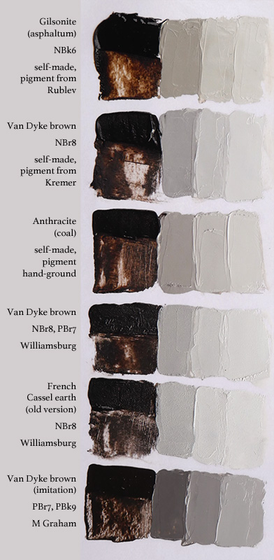
Other aspects of the paint, such as how loose or stiff it is, may be very different even between paints that are similar in color. For example, the Old Holland paints above are the stiffest, while the M Graham and Winsor & Newton paints were much looser. Blockx was smooth and buttery, but not as stiff as Old Holland. The paints I made were loose and had no stabilizers added.

The more exotic ochres at the bottom aren’t seen as often in paint lines but have a greater variety of opacity and hue. A few of them I made myself from dry pigments. In some cases, such as the orange ochre from Rublev, those can also be bought as already made paint. I just don’t have those paints myself and my efforts to make paint shouldn’t be taken as good examples of what the already made paint would be like.

A couple of especially notable paints in this chart are the lemon ochre for its brightness and clarity and the orange ochre for how similar it already is to certain skin tones when just mixed with white. If I were to just choose two, those would be my favorites.

All of these swatches were mixed with Williamsburg titanium white. I tried to mix equal amounts but could have been a little off. The photo was taken in sunlight and white balanced in Photoshop, but may not be perfectly accurate. Some of these tubes were old and may not represent what these brands currently produce.

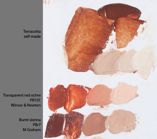
A similar comparison of red ochre oil paints can be found here.

Asphaltum, Van Dyke brown, Cassel earth, and Anthracite

Brown Oil Paint Comparison 1

In this brief comparison I have a variety of unusual brown paints that each have long histories but are seldom used today.

Van Dyke brown is one whose name is commonplace even if the genuine paint is not. It’s named after Anthony Van Dyck, a famous Flemish portrait artist who made extensive use of it in the 17th century. It’s also known as Cassel earth because of the deposits of it near the town of Cassel, Germany, and carries the pigment designation NBr8 (natural brown 8) because it contains natural organic matter.

The last paint in the chart above is a modern imitation of Van Dyke brown. It’s actually a mixture of pigments – in this case burnt umber and ivory black – that only imitates the color but not the handling of the original pigment. There’s many other modern pigments and mixtures that also borrow their names from some historical pigment that’s either no longer used or is only rarely used, such as indigo, sap green, vermilion, etc. As is often the case, part of the reason to make a modern imitation is because it’ll have better lightfastness than genuine Van Dyke brown.

Although it obviously has much higher tinting strength than the other paints – the third tint is a 1:7 mixture with titanium white and is close to the 1:1 mixtures for all the others – it also loses its limited chroma very quickly when tinted to higher values. The Gilsonite and anthracite may be weaker tinting but they’re also much more chromatic at high values.

I also made an area, not shown here, of evenly spread test strips of each paint that I check each day to see how long it takes for each to dry. All of this was started nine days ago and as of the time I’m posting this only two have dried because most of these are slow drying paints. I’ll keep checking and update this when or if the others dry.

Brown Oil Paint Comparison  1 top

These three I made from dry pigment, using linseed oil from Rublev. Nothing else was added, and I don’t know for certain how well they’ll dry on their own. They probably could have benefitted from a little bit of umber (PBr7) being added, because that contains manganese and acts as a drier for oil paint.

Gilsonite is a bitumen-impregnated rock that’s mined in Utah, USA. Bitumen (NBk6), also called asphaltum, has had many uses since ancient times, such as waterproofing for boats and ships. Today it’s still used for things like road construction, hence the term asphalt. Another example of use is that Ford model T cars were black because they were coated in a laquer made from Gilsonite. There’s many other possible applications for it. This is the most chromatic of all the paints here, but I’m unsure of its longevity as bitumen gained a reputation in the early 19th century for causing oil paintings to crack.

Anthracite, a high purity grade of coal, was used along with lower grades of coal by some artists in the past as a black pigment. Almost three years ago I made some watercolor with it, seen here.

Brown Oil Paint Comparison  1 bottom

The tube of Williamsburg’s Van Dyke brown was given to me by Williamsburg a couple of years ago and is one of the two varieties of this pigment they offer. Only two other brands – Rublev and Vasari – make paint from genuine Van Dyke brown. It has raw umber in it, but just enough to decrease the drying time to about a week without having much impact on how the paint looks or handles. The test strip took seven days to dry.

French Cassel earth is Williamsburg’s other Van Dyke brown. My tube is their old version from before they reformulated it to also have a small raw umber addition. Both of these Williamsburg paints have a large pigment grain and produce unique results that would be impossible to produce with modern imitations. Although they may look gritty in this photo, it’s not difficult to use them.

For comparison, M Graham’s paint here is a modern paint that has been given the name Van Dyke brown. Even if modern imitations are very similar in color they may be very different in handling, as you can see in how it has more uniformity and its covering power made it comparatively difficult to smudge thinly. In this case I think it’s due in part to the smaller particle size of the pigments used here. This paint was dry the first day that I checked the swatches, only about 24 hours after making them. That’s even though this is the only paint here that’s made with walnut oil, which normally takes a little longer to dry than linseed oil.

M Graham’s paint is itself an excellent paint, but there is a large difference between its handling and that of genuine Van Dyke brown. Whether this difference is an advantage or a disadvantage depends on the situation and the painting style.

Cobalt Blue Comparison

Cobalt Blue Comparison

In a forum thread we were discussing cobalt teal and I posted this photo of various cobalt blue pigments in oil paint, which I thought I’d share here too. I can’t guarantee color accuracy in the photo, but I think it’s close.

Regular cobalt blue is normally made from the pigment PB28 and it’s a good, but often expensive, middle blue. It dries fast because of the cobalt content. Compared to ultramarine it’s a little more opaque and has a little less red while being lighter in masstone. Although this particular pigment is called by the name cobalt blue, all of the above paints contain cobalt. The difference between them being which other metals are included, such as aluminum or chromium, and in what amounts.

There’s two pigments that are labeled as cobalt teal by the paint makers that offer them. One is an uncommon and very opaque teal version of the standard cobalt blue pigment, PB28, and the other is a teal version of one of the cobalt greens, PG50. They’re similar enough that if you have one you won’t need the other. I almost never see other artists talk about having teals like these on their palette, so they must not be popular. I think they can be useful for painting green hills far in the distance, and definitely tropical water, but until now I’ve also rarely used them myself.

PB36 is another pigment that comes in a large range of varieties. Although it’s not the original cerulean blue, PB36 can be so close to the original in appearance that it’s often given the name cerulean. At the other end of its range are blue turquoise and green turquoise varieties. Shown here is a green turquoise. I like the turquoise color, but again I rarely use it.

The original cerulean is PB35. It typically dries to a more matte surface. Either this or the PB36 version labeled as cerulean would be good for painting skies, especially closer to the horizon where the sky has more green, as they are both slightly greener than cobalt blue. I actually prefer the PB36 version of cerulean because the color has a little more intensity to it. The name cerulean probably comes from the Latin word for heaven or sky.

Lastly, in the right column I mixed all of these with an equal amount of nickel titanate yellow, which is a somewhat dull lemon yellow, to see how they’d behave.

Verdigris Part 2: Oil Paint and Matching

Verdigris 5

After my first verdigris post I made some more pigment and now I finally got around to making some proper oil paint with that, seen on the left of the image above. This was made with poppyseed oil and it was very easy to mull, requiring almost no effort. The finished paint is a really nice turquoise that’s extremely transparent and has extremely low tinting strength. I used a 1:1 mix with zinc white to tint it and it was still very strongly affected even by zinc white, so glazing seems to be the best use for this pigment in oil.

As I mentioned before, almost no one at all presently sells verdigris as either a dry pigment or as a paint of any kind, even though for a couple thousand years it was among the most vivid greens available. A big reason for that is the mix I made on the right side of the image above. Verdigris is moderately toxic and well known to have problems with lightfastness, but the mix I made using only lightfast, non-toxic, and inexpensive paints is nearly a perfect match. I used a lot of terre verte (hoping it’d lend transparency and low tinting strength), french ultramarine, a very small touch of phthalo green to increase the chroma, and zinc white (again hoping for transparency).

The mix isn’t as transparent and has far higher tinting strength, even though I used so much terre verte. Plus, the mix was only intended to match verdigris. Exceeding its chroma with the same hue is very easy with modern pigments, and the high transparency could probably be matched by adding some painting medium to the mix.

In conclusion, my curiosity of what this historical pigment was like has been satisfied and I can now say that it really is an obsolete pigment. It was fun and interesting to make, but there is really nothing that it would offer today that isn’t done better by modern pigments.

Verdigris 4

Here’s a photo of the second batch of pigment that I made in the copper dish, again using white vinegar. I tried using a different kind of vinegar, I think rice, in a separate dish but it only had a minimal development of verdigris and didn’t look any different.

UPDATE

Verdigris 6

Left: Verdigris mixed with cadmium yellow pale (Winsor & Newton, about 15 year old tube)
Right: the same cadmium yellow mixed with blues and greens to approximately match the mixture on the left, as a control sample
Photographed after 48 hours.

As you can see, the verdigris appears to have darkened significantly. I believe it’s in reaction to the sulphur in the cadmium yellow. From what I’ve read verdigris can also darken just from sulphur in the air.

Verdigris 7

For some reason the original swatch of verdigris, on the left, has also changed color in comparison to the control swatch on the right. In this case it’s more of a hue shift than a darkening though. This swatch was made a little less than 4 days ago.

So my experiment with making verdigris probably didn’t make the purest or highest quality pigment possible, and there’s obviously things that I don’t know about chemistry, but what I’ve seen has reinforced my opinion that this historical pigment is obsolete when I consider that I have never seen paint change like this before.

Genuine Terracotta Oil Paint

Terracotta Oil Paint 5

Here’s some oil paint that I made from a shard of a broken terracotta pot. Some paint brands like to sell a paint called terracotta, but here I now have the real thing. Genuine broken pot paint. 🙂

I photographed all of this in the afternoon sun. The tints are with titanium white, but I didn’t try too hard to make it exactly even ratios this time. The other two paints in the photo are just there for comparison.

It actually does make sense to do this when you consider what natural red ochres and synthetic mars reds are made of. Basically, red ochre is primarily colored by iron oxides and, depending on the source, also contains large amounts of things like clay, quartz, gypsum, etc. Mars red is made through chemical reactions using ingredients like powdered iron and is baked at high temperatures. A mars red is very similar to a natural red earth but without the mineral impurities. To make a terracotta pot (or red bricks) that mars red is then mixed with things like clay. So, as I’m understanding it, a powdered terracotta pot really isn’t much different from a natural red ochre.

All I used was this one small shard of the pot. Before now I had actually been putting the pieces into the bottoms of other pots to improve the drainage. To grind it into powder I switched back to my old granite mortar and pestle. It actually broke down a lot easier than I expected, and I only ended up using a about a third of the powder.

To make it into paint I mulled the powder with a mix of linseed and poppyseed oils. Of all the drying oils used to make oil paint for artists, linseed oil has the highest percent of linolenic acid. It dries the fastest and makes the strongest paint film, but it also yellows the most over time. Poppyseed oil has little if any linolenic acid, but one of the highest percentages of linoleic acid. It’s one of the slowest to dry and doesn’t make as strong of a film, but has a lighter color to begin with and is supposed to not yellow nearly as much. That’s why some brands specifically use it for very light colors such as white, where even a small amount of yellowing would be noticeable. The mix of the two oils should produce a paint with a stronger film than just poppyseed and that doesn’t yellow as much as linseed with a drying time between the two. Some brands of paint do also mix oils for reasons like that. Mostly though I did the mix because I’m running low on linseed oil but I have plenty of poppyseed. 🙂

Terre Verte / Green Earth

terrevertecompare1b

Getting a good photo was hard, and even this isn’t perfect. Whenever I’ve made oil paint from this pigment it’s extremely short paint when it’s freshly made. Even without any stabilizers added the consistency of this paint is the closest there is to being like butter. I think I could even make a sculpture with it.

Genuine terre verte is very transparent and weak tinting. It’s good for glazing, for example. Some brands make an imitation terre verte by mixing pigments like phthalo green with burnt sienna, but the imitations are always far too opaque and are much stronger tinters.

Cool terre vertes, like the Nicosia green earth and the French terre verte at the top, are hard to find. Everyone seems to prefer making the warmer varieties. Sometimes I like to add a little terre verte to ultramarine to make it closer to a middle blue. 🙂


Ultramarine, Lapis, Indigo, and Indanthrone Blue Charts

Blue Compare 1

A while back I had posted this chart on a forum in response to a question about what these blue paints looked like compared to each other. The color isn’t 100% accurate but it’s close enough to show how they compare. The box on the right shows color averaging from the first 1:1 mix with white for each paint for comparison.

Ultramarine
This is a workhorse paint. It’s a very good, strong, easy to use, and useful color that’s reliable to not fade. Every brand of paint sells this and it’s always one of the least expensive from any of them. It’s hard to find a more perfect paint. Almost every paint set for students includes this. For most artists that I’ve seen, if they only have one blue on their palette, it’s usually this one. This is sometimes referred to as “synthetic ultramarine” while talking about lapis lazuli, which is natural ultramarine.

Lapis Lazuli
Natural ultramarine is the opposite of synthetic ultramarine in almost every way. It’s weak, dull, very expensive, only available from a few brands, and difficult to use in many painting styles because it’s so transparent and so easily overpowered by anything you mix into it. You can see this from how light it becomes when mixed with the same amount of white as any of the other paints on the chart were. It’s good for glazing because of its high transparency, and in watercolor it’s actually useful for its high granulating texture. Other than that I think a lot of artists tend to have high expectations for this famous paint that’s spoken of so highly in much of art history but when they actually try it themselves the paint doesn’t match the hype. There’s different grades of pigment depending on the purity and to make this from the highest purity would be extremely expensive. I think it’d be better to just use synthetic ultramarine.

Indigo
Natural indigo is known to fade and I don’t think anyone makes paint with it anymore. Synthetic indigo is PB66, only used by a few brands, and I’ve read conflicting reports about its lightfastness. Almost all paints named “indigo” today are just mixes of blue and black, sometimes including other pigments such as a little violet, with each brand using their own mix. The synthetic indigo in this comparison is very slightly bluer and less grey than the mix below it (which is made from phthalo blue, lamp black, and ultramarine), but if you wanted the mix to be bluer it would be easy enough to just add a small amount of extra blue to it. Doing this would avoid any question of whether synthetic indigo is actually lightfast and you wouldn’t be confined to just the few brands that make it. If you want to use a so-called “Zorn palette” (usually yellow ochre, vermilion or light cadmium red, ivory black, and white) you could consider indigo instead of pure black to give the palette a little more flexibility. Greens would be slightly easier to mix and the cool greys would be a little more believable as “blue” when placed next to a bright red than simply mixing black with white.

Anthraquinone, Indanthrone, or Indanthrene Blue
The name depends on the brand, but I call it indanthrone. The popularity of this slightly reddish blue seems much lower than many of the others because I rarely see it on anyone’s palette. I think it’s usually somewhere in the middle of a brand’s price range and is clearly not as intensely chromatic as ultramarine. It has much more tinting strength than ultramarine though, so a smaller amount of this paint will go further in mixes, possibly offsetting the price. It also seems a little more opaque than most blue pigments. I used to use this a lot early on when I started painting and was exploring different pigments, but I haven’t used any for a long time now. Maybe that’ll change.

Deepest Forest

Deepest Forest

Oil on glass

An abstract experiment. I was making some oil paint today using terre verte pigment (PG23) from Sennelier and I liked the way it spread on the grinding plate. That’s a little more than half a tube worth of paint. Of course, after taking the photo I scraped it all up to put it in a tube.

Silver Forest

Oil on steel

I thought the paint on my palette knife looked like trees with a silvery cloud moving over them. ^_^

edit- aaaah! I knew I hadn’t posted anything in a while, but I didn’t think it’d been over half a month. I have a lot of paintings I’ve been working on, and a few are even finished or close to it, so… yeah. I guess I’ll have some more posts coming shortly. 🙂

Mars Yellow Paintings

Click for larger size

Oil on canvas, 10″x8″

This painting is loosely based on a Chinese landscape painting I saw in a book of mine called The Jade Studio. It’s a very good book, but I don’t have it with me right now so I can’t look up any information on this painting or the others except what I had already typed. I only used mars yellow that I made myself and titanium white from M Graham.

I finally decided to try making some oil paint a couple of weeks ago with the glass muller I had gotten from Natural Pigments. So far I’ve only used it for making watercolor because I thought the cleanup after using it for oil paint would be a bit of a hassle… and it kind of was. I think the result I got was worth it though. I used mars yellow (PY42) pigment from Blue Ridge and walnut oil from M Graham. The finished paint was very soft and kind of goopy and ropey, which I like.

The only problem was that I made way too much of it. I made alla prima painting after painting with nothing but mars yellow, and sometimes white, trying to use up as much as I could.

Click for larger size

Oil on canvas, 10″x8″

This is a copy of a painting from a series of paintings by Dai Xi (1801-1860). I think it’s leaf 8 of the first album from his “Double Album of Landscapes” if I’m understanding this book right, but I don’t have the title for this exact painting. I can’t seem to find this painting online to show what the original looks like. In my version I only used mars yellow. There’s no white paint or any other paint. In the lighter areas I thinned the paint a little (or a lot) using Gamblin’s Neo Megilp, which I recently got and wanted to try out, and the white areas are completely blank canvas. This was kind of an experiment because I don’t think I’ve left parts of a canvas blank before, but it can be done in watercolor so I tried it with oil paint.

Click for larger size

Oil on canvas, 10″x8″

Another copy of a painting that I don’t know the name of from that book. It was a winter scene with a lot of snow and grey skies. This one also has blank canvas for white and thinned paint in the lighter areas. The original had some buildings too but I left them out. I think this is the only one I didn’t paint in one sitting, but I also didn’t paint over anything either so it might as well have been painted all at once.

Mars Yellow 3

Oil on canvas, 5″x7″

This isn’t based on another other painting, but I wanted to experiment with it. I already had a small canvas that I had covered in several coats of white acrylic paint to smooth out the canvas texture. I was planning on making a completely different painting on this, but I wanted to try this paint to see what kinds of brushstroke textures I could get on the smooth surface. I think it worked out well, except that for some reason even though the paint wasn’t very thick it took a long time to dry. I would have posted all of these a week ago if this had been dry but even still it’s too sticky to set on my scanner. I took a photo instead, in early evening shade, which is why the colors look different.

Red Ochre Oil Paints

PR101 and PR102 (Pigment Red 101 and 102) are among my favorite pigments for paint and they come in a large variety of colors. PR102 is a natural red iron oxide (red ochre) and PR101 is the synthetic version. Below is my collection of oil paints using either of these as a single pigment paint with nothing else added. I photographed this in direct sunlight during the afternoon. All of the paints were mixed twice with about an equal 50/50 mix with white.

PR101 PR102 samples

Old Holland Yellow Ochre Burnt
This is my only natural red ochre in oil paint. As I understand it this pigment is made by roasting natural yellow ochre pigment until it turns reddish. It could make a good alternative to burnt sienna. It’s a little lighter and brighter, and has a stronger color.

Winsor & Newton Transparent Red Ochre
I wasn’t really sure what to expect when I got this because the name sounds like it’d be what’s normally called Transparent Red Oxide, which is the variety of PR101 that W&N already uses in their “Burnt Sienna”, but this is really very different. I think it’s close to the same as the Yellow Ochre Burnt above it but this is a slightly cleaner and more pure color. As the name suggests, this paint is semi transparent. The tinting strength isn’t as overpowering as some of the others in this list so it’s a bit easier to work with. This is one of those paints that I wish I had gotten years ago. It might even be my favorite red ochre.

Rembrandt Burnt Sienna
Although real Burnt Sienna is made from either PBr6 or PBr7, there are a few brands of paint that use a Transparent Red Oxide version of PR101 instead, which has a much stronger color, higher transparency, and higher tinting strength than actual burnt sienna. It doesn’t show up well in the photo but this particular one is lighter in masstone than the “burnt sienna” below it from W&N.

Winsor & Newton Burnt Sienna
A nice example of Transparent Red Oxide. It has good transparency. I tend to prefer paints like this over actual burnt sienna for the greater color strength.

Blue Ridge Transparent Red Oxide
Very similar to the above paint, but not as transparent. This one also seems to have a slightly higher tinting strength, but I can’t guarantee that I got the mix with white an exact 50/50 mix on any of these.

Old Holland English Red
Now we’re getting into the slightly cooler temperature colors for red ochres. This is a very high tinting strength paint, and easily overpowers most other paints that I mix it with unless I use extremely small amounts of this. Because of that, I don’t think I’ll ever run out of this one when you consider how little of it is needed in each paint mix. This one it so similar to the venetian red below that I actually mixed up the labels on the image at first. I’m 99% sure I have it right now since I kept the tubes lined up in the same order that I placed the paint on the palette and because this paint has a thicker, more viscous consistency.

Winsor & Newton Venetian Red
There’s a little bit of variety of colors that are referred to by different brands as “venetian red” but this name is generally given to a semi-cool earth red that’s not as cool as something like an Indian Red.

Blockx Mars Violet
As far as I know this is about as cool as red ochres can get. I bought this one from Blockx because when I looked at a paint chart someone else had made of different brands of mars violet the one from Blockx looked like the coolest. On an earth palette of red and yellow ochres this could be a very useful.

A similar comparison of yellow ochre oil paints can be found here.