Aspen Against Evergreens

Colorado Aspens
Watercolor and ink on paper, 4.5″ x 6″

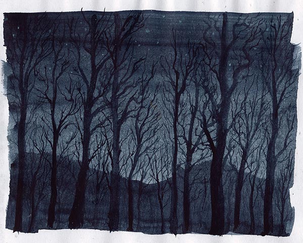
A little over a month ago I was passing through the front range of the Colorado Rocky Mountains and there were lots of aspen trees at the peak of their fall colors. They were interspersed among evergreens and I got a few nice photo compositions.

However, when I started this painting a week and a half ago, all I had with me for paints were watercolors. They turned out to ill suited for this scene because of all the little yellow leaves. With watercolor you typically work from light to dark, because most of the paint isn’t opaque enough for light colors to show up well on top of dark colors. That’s why watercolorists normally try to “save their whites” by avoiding painting anything that should be light with dark colors as it would be difficult to lighten it later. With so many tiny dots of yellow surrounded by dark colors it soon became obvious that to preserve the yellow leaves I’d have to first paint a general yellow shape and then define the leaves by tediously painting around each one with dark paint and a thin brush. Instead, I opted to just draw on top of the watercolor with a couple of pens to indicate all of the leaves. It was still tedious, just not as much as it would have been. Some leaves I was able to accent with dots of an opaque bismuth yellow though, so the dark to light approach isn’t a set in stone rule.

Aspen Against Evergreens - photo

The reference photo required a lot of editing because it was taken in poor lighting and started out very dark. After brightening it I actually darkened some parts of the background again to help the center tree stand out a little better and reduce background distractions.

Nature Study, Trees, after Asher Durand

Nature Study, Trees, after Asher Durand
Gouache on paper, 6″ x 9″

Normally I don’t put enough effort into modeling the branches of trees or making them naturalistic, so I thought it would be beneficial to practice a little while using a reference as a guide. This was also a good chance to practice using gouache in a more opaque way as the highlights on the leaves were built up. Gouache can be used very similar to watercolor, which is what I tend do during the rare times that I use it, but layering denser applications of opaque paint isn’t something watercolor can do.

If you’re using a low resolution screen the details might be hard to see, so there’s a larger view of this painting here- full size

A Land of Hills and Valleys

Land of Hills and Valleys

Watercolor and gouache on paper, 3.5″ x 8.5″

Recently I was reading a passage in the Bible, Deuteronomy chapter 11, in which Moses was describing to the Israelites in the wilderness what the land they would enter into would be like. This chapter is one of several places that uses the famous phrase “a land that floweth with milk and honey.” After explaining that it wouldn’t be like in Egypt where they irrigated by their own work, they were told that they would receive rain for their crops. I especially liked the wording of verse 11, “But the land, whither ye go to possess it, is a land of hills and valleys, and drinketh water of the rain of heaven.” This is what I was thinking about when I made these little paintings above.

The chapter goes on to explain that receiving the blessing of abundance of rain would be dependent on their faithfulness to God, saying “…if ye shall hearken diligently unto my commandments which I command you this day, to love the LORD your God, and to serve Him with all your heart and with all your soul, that I will give you the rain of your land in his due season…”

The paints I used the most was a 1:1 premix of phthalo green blue shade and ivory black, Monte Amiata natural sienna, a little bismuth yellow, a couple of different blacks with white gouache, and a light blue gouache premix. The rain in the bottom painting took a long time because I didn’t actually paint the rain. Instead, I painted everything, and then I darkened everything except those lines for rain. So it looks like those lines are painted lighter, but actually they were just left at the amount of lightness that everything had before I darkened everything.

Forest Sketch 4

Forest Sketch 4

Pencil: Palomino Blackwing
Paper: Canson sketch universal, 5.5″ x 8.5″ 65lb

This pencil has an interesting history. The version I have is just the Blackwing, not the 602 which I’ve read has a little firmer lead. This one is dark and feels smooth.

Also, I updated my previous post on verdigris with some new photos. I may try to do some more with it in the future, mainly to try making a purer verdigris pigment as I’m sure that what I made has impurities.

Last Light

Last Light

Watercolor on regular printer paper, 3.75″ x 2.75″

I was about to try sketching a portrait in watercolor, but then I noticed the light outside was very dark and blue. It was after sunset but there was enough light to see the shapes of trees and the hills behind them, so I sketched that instead with indigo watercolor.

Even regular printer paper can be used for watercolor, though it absorbs the paint quickly and can’t be worked much before it starts to tear so you have to work faster and more deliberately. At the very least, it can be a very inexpensive way to sketch out ideas or test what colors will look like next to each other or practice brushstrokes. A lot of artists, including myself, say they feel more confident when working with cheaper paper because they aren’t as worried that they’ll make a mistake and waste their materials. When using printer paper I feel like I can try anything and not worry.

Morning on the Seine

Morning on the Seine 2

Oil on canvas, 10″ x 8″

I made another painting based on Monet’s series on the Seine, such as this painting. This is yet another painting that I started a couple of months ago and then finally got around to finishing just a couple of days ago.

I don’t remember what colors I started making this with, but at the end I painted over everything transparently using lapis lazuli (natural ultramarine, Daniel Smith), lemon ochre (PY43, Williamsburg), and a lot of zinc white (PW4, Daniel Smith). Getting a good photo with accurate colors was hard, so I did some editing to this and maybe the colors are close. They’re still a bit off though.

I think that the paintings in this series by Monet are among my favorite paintings. I keep them in a folder on my computer, along with many other artworks, that I labeled ur-poems because it was the best term I could think of for them. Everything in that folder are things that, when I look at them, seem to me to be the closest representation of an ideal in my own artistic vision that I want to achieve.

Forest Deer

Forest Deer

Photoshop illustration, 521 x 322 pixels

I made this over a year and a half ago but it looks like I never posted it. The canvas dimensions are from the Lucas Numbers with 521 being the next number in the series after 322.

Digital illustration was always something I was really interested in because of the amount of amazing art people have made with programs like Photoshop, but I never really got very good at it or fully comfortable with the tools. I do like how this one turned out though. Maybe I’ll give it another real, good, honest try, and not like the “tries” I’ve made in the past, the next time I have a chance, in a week or so.

Snow Coyote

Snow Coyote 1

So just minutes after my last post where I mentioned sometimes seeing coyotes my mom saw one. It was near the road and about to cross but a car came and it turned back. It’d be nice to have a longer range lens for my camera, but this first photo was the best one to zoom in and crop.

Snow Coyote 2

Here it is when it first turned back from the road, which is to the right of the photo. While I don’t personally mind the coyotes being here, and they were here long before people ever came and built houses, it’s a little concerning that just on the other side of tree on the right side of the photo is a playground for children.

Snow Coyote 3

At one point while I was watching it stopped and suddenly jumped on something. Maybe there was a mouse hiding in the snow. A distance away I saw a rabbit run but the coyote didn’t see it.

Snow Coyote 4

Somewhere hidden in the brush is where it lives, and probably one or more others. I don’t know where they disappear to when they leave. I like the colors and textures of this last scene so maybe I’ll paint it later.

Snow Fall

Snow Fall

This was the scene I saw out the back door this morning at my sister’s house. I liked the way the camera’s flash made the snowflakes close to me light up. Sometimes when I look out there I see coyotes out in the open. For those of you living in other countries they’re like wolves but a little smaller. A lot of rabbits live out there too and nearby is a prairie dog colony, so the coyotes have a lot they can eat. The path is covered in snow, but that’s where I walk when I want to go to some nearby restaurants past those trees or to take my sister’s dogs for a walk while I visit her.

I’ve been sick with the flu for almost a week now and I haven’t had much energy to do much, so I’ve barely been painting or drawing.