Resting Tiger

Relaxed Tiger
Ink and white gouache on tan paper, 7″ x 7.5″

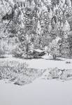
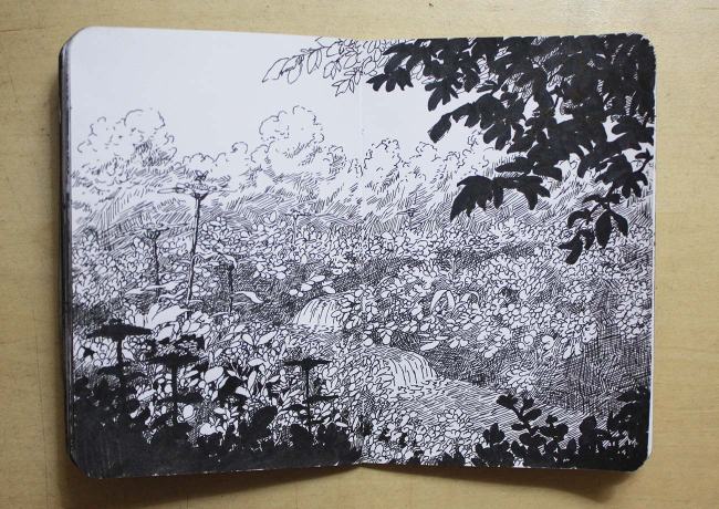
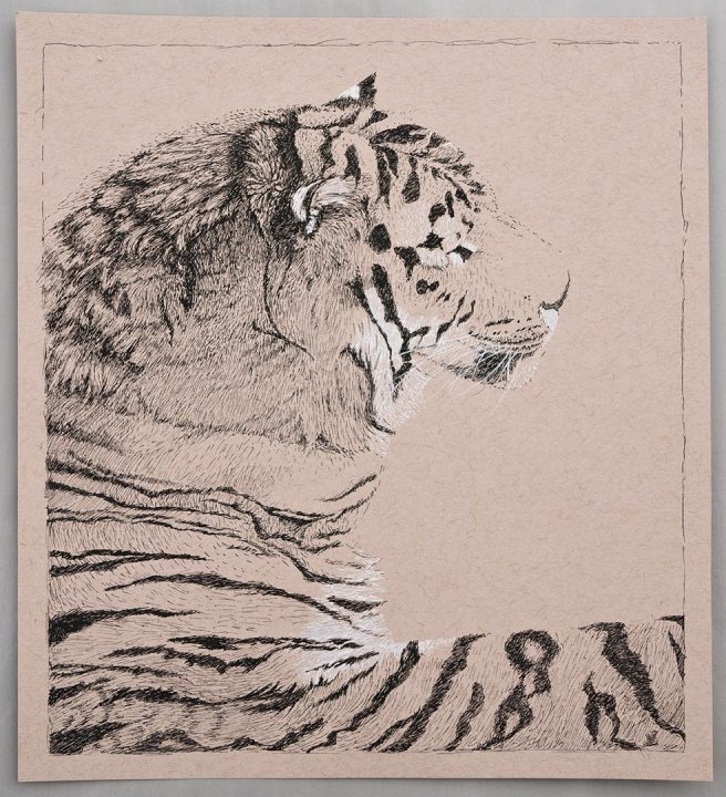
Lately I’ve been practicing with a newly bought dip pen. I like the tactile sense of the nib on the paper. The white is white gouache, thinned with a little water and applied to the nib with a brush. It’s not as convenient as ink, but opens more possibilities.

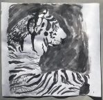
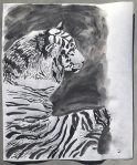
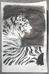
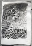
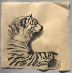
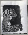
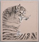
The reference photo was one I recently took at the new tiger exhibit at the Denver Zoo. I had wanted to practice sumi-e painting and tried it with an ink stick on an old roll of paper. Then I started trying other papers, and on every painting tried a different brush. In the end they didn’t seem very successful, so I’ll have to more practice again, but after a few days I decided to revisit the same photo with the dip pen.

Azure Valley 2

Colorado Mountain Valley
Ink on printmaking paper, 3″ x 4″

This is the same valley in the Rocky Mountains seen in this post a couple of weeks ago. The brown is walnut ink from a fountain pen, which is not waterproof and in some places I used a wet brush to blend it. The black is from a Micron brush pen.

Mostly I just started drawing this to try out the combination of tools. I haven’t used this brush pen for a long time and wanted practice making something with the tools that I’m planning on taking on a trip. It was kind of tedious doing all of the shading though. Getting some grey ink might have been better than crosshatching with the very tip of the brush pen.

Winter Robin

Robin in a Tree
Watercolor on printmaking paper, 5.5″ x 4″

A couple of weeks ago I saw this American robin in the aspen tree in front of my house. For some reason birds always act like they think you’ll reach up and grab them, even though my arms clearly aren’t that long (and I wouldn’t, anyways). All of the paints for this I made myself from dry pigments.

Walnut ink on printmaking paper, 3" x 4"
Walnut ink on printmaking paper, 3″ x 4″

Here’s a drawing from yesterday that was made with a fountain pen. It’s actually a copy of one of the photos I posted here about four years ago.

Hinterland

Cabin at the Forest Edge
Watercolor and ink on 300 lb soft press watercolor paper, 5″ x 7.25″

This was first drawn with a dip pen and waterproof black ink, using a photo I took from the train in the mountains of Colorado as a reference. Then I painted over all of that with watercolor. For the warm colors it’s a mix, in varying proportions, of dark ochre and warm sepia. That was then mixed, again in varying proportions, with payne’s grey to get the greys and darks. The cool shadows on the snow are a mix of payne’s grey and cerulean.

Since the last post I started a couple of paintings, but they weren’t working out and I decided to set them aside and try something different. This drawing probably ended up being more detailed and time consuming than necessary, but it’s something I’d like to practice more. Next time though I’ll probably try for a more basic drawing and let the paint do most of the work because this just took too long to finish. I have at least been keeping up with my reading, and just a couple of nights ago finished reading Steps to Christ for the third time now. It’s a great book.

Here’s the reference photo and the ink drawing before adding paint.

Waterfall Book 20

Sheep and Lamb Crossing
Ink on paper, 7″ x 5″

When you’re small, even a little waterfall can look like a big challenge. The patient care and encouragement of another can make many obstacles surmountable.

As I drew this I thought about Moses leading his flock while in the land of Midian. Long before that, when Moses first thought it was time to save his people from slavery, he wasn’t ready. He was too impulsive and his people needed more care than he knew how to give. To be properly prepared he needed to first tend to a flock in the wilderness for forty years. There he learned the patience, gentleness, and faithful reliance on God needed to guide an erring flock.

The materials used for this:
One of the wooden pens I carved a long time ago
Daniel Smith walnut ink
Noodler’s black ink

As I drew it became more difficult to control the ink flow because the tip of the pen was wearing down. After quickly resharpening the point with a razor the problem was fixed.

The lamb was referenced from Nicola B and the sheep from Angeline Rijkeboer of Paint my Photo.

Deer and Sheep

Deer, Sheep, and Snow
Watercolor and ink on paper, 7″ x 5″

I made a few tries at this scene with different media each time. This third try started with pencil and micron pens followed by a mix of blue and reddish brown watercolor. Using watercolor over an ink drawing like this is something I don’t do often. The watercolor needed a lot of adjustments to fine tune it, such as lifting most of the background when it was all too dark, but I like how it worked. The reference photo is again from Paint my Photo, here.

Waterfall Book 16

Linocut print of a waterfall
Linocut, 7″ x 5″

My first finished linocut prints. I got this beginner block printing set maybe a couple of years ago, but it was a little intimidating and I never went through with making a finished product until now. This is what I wanted to do for last week but I needed to practice more.

I was worried there’d only be one chance to get it right, but actually the right side block didn’t have enough ink and had to be pressed a second time. The alignment was slightly off on the second try though, and the ink coverage still isn’t solid, but it’s close enough.

With so little experience I can’t give a tutorial other than to show a few photos of the process, but there’s a very good tutorial from Catherine Cronin as a pdf link on this page over here.

The first block was used for practicing the cuts, inking it, and figuring out a style. There was a little experimentation with different colors of gouache, but the ink was working out the best so that’s all that was used in the final.

Waterfall Book 12

A gentle stream through a meadow

Ink on paper, 7″ x 5″, Click here for full sized image

This week was a struggle. I probably tried doing too many different things that I’m not used to in one drawing. It all started by hoping to make some positive changes after I critiqued myself about a few problem areas in my art. Stiffness and lack of accurate or realistic detail are near the top of the list and always have been. That lead to many last minute practice sketches unsuccessfully trying to copy someone else’s style that’s the opposite of mine. This week’s drawing is now the result of one adjustment to the original plan after another in an effort to cope with the unfamiliar territory.

Once the final plan was moving forward the hardest part was probably trying to force randomness and variation while only using a limited number of shapes. Towards the end it became a test of endurance to draw so many leaves, and then a rush to get it done and posted while it’s still Wednesday for me.

Materials used:
Koh-i-Noor rapidograph 00 (.3) technical pen with waterproof ink
Used for all the thin black lines. Autocorrect keeps wanting to called it a radiograph.

Kuretake brush pen #8 with non-waterproof ink
Used for dark shadows. The original plan was to take advantage of this ink being not waterproof and use a wet brush for blending and shading after it was on the paper along with either colored ink or watercolor after that. The moment I tried to blend it with water it bled through the paper. That ended all of those plans, so once again it was necessary to change course and adapt. That’s when the cross hatching started.

Waterfall Book 10

Waterfall Book 10

Ink on paper, 7” x 5”

Last March I ordered a Kuretake #8 fountain brush pen but found it too intimidating to use and set it aside. Drawings that others make with brush pens seem so gracefully decisive, describing subjects with minimal lines and no mistakes. The packaging also listed many instructions, including symbols for dire warnings, but it was written entirely in Japanese. Hmm. Well, worries of messy lines and mysterious warnings finally brushed aside, the pen has been used today.

My basic idea here was a scene with a stream originating from a distant mountainous area that becomes gentler towards the foreground where it can be a source of blessing, based on some verses in the Bible. One of them was Psalm 23, verses 1 and 2 saying “The LORD is my shepherd; I shall not want. He maketh me to lie down in green pastures: He leadeth me beside the still waters.”

Another very appropriate verse I found later is Proverbs 25:25, “As cold waters to a thirsty soul, so is good news from a far country.” This verse has a strong application in the New Testament as well. The word “gospel” literally means “good news” and in the famous scene of Jesus talking with the Samaritan woman at the well He presents Himself in terms of a well of water that quenches thirst in a way that the material things of this world never can. This is the thirst of a soul.

waterfallbook_10b

Here’s a clearer image of the waterfalls and sheep.

Waterfall Book 5

Waterfall Book 5

Ink, colored pencil, and charcoal on paper, 7″ x 5″

This time I wanted to try using ink from a bottle. Originally I was going to use a dip pen that makes very thin lines, but in my idea sketches I tried a bamboo pen, a palette knife, and then a foam brush. They all worked well and produced unique results. I especially liked how the foam brush produced many parallel lines when it had only a little bit of ink on the tip, which is how I made the falling water, and how easy it was to cover larger areas with it, so that’s the one I choose. The ink started to bleed through the paper just a little though, so the next drawing on the other side of the paper will need to be planned to cover that up.

Once the ink was dry I could color over the top of it with pencils or white charcoal to add highlights and various details. The dark areas of the water at the bottom are black charcoal smudged smooth with a rolled paper blender.

Waterfall Book 5 Tools

Here’s all of the tools I used for this drawing.