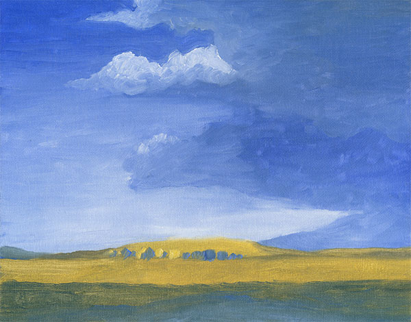
I have this one photo of a cloud with the morning light on it that’s very similar to this, but not exactly the same, and I wanted to paint something like that. I was especially impressed with how this cloud was dark, which made it stand out from the lighter higher altitude clouds behind it, and had such strong vermilion highlights under it from the sun. That really made it stand out in the sky. The cliffs and trees are made up though, as the original photo had the roofs of houses at the bottom instead.
This was painted on aquaboard, which is like gesso board but made for watermedia. It’s been a long time since I’ve used aquaboard for anything, but it has its advantages. Like Yupo, it’s very easy to rewet and wipe dried paint off of it, but quite not as easily as Yupo can. The palette is the new weekly theme that I posted on Instagram here a couple of days ago. Only the cerulean is gouache, the rest is watercolor. The reason for using gouache for the cerulean is because both of my tubes of cerulean watercolor are experiencing a lot of binder separation, which often happens with cerulean, and it was faster to just use this gouache to fill that role on the palette. It’s very similar, but more opaque.