Zirconium Blue and Cerulean Comparison

Zirconium cerulean (PB71) watercolor in center, surrounded by similar blues on Arches 140 lb paper.

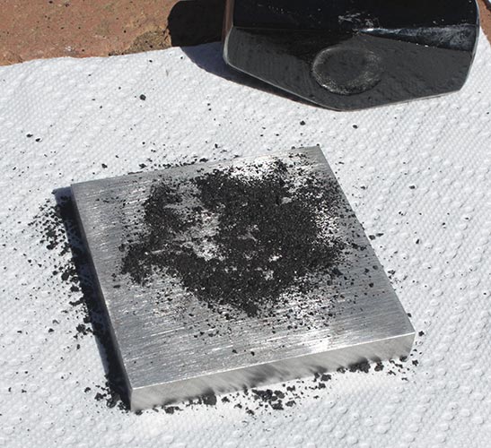
I was asked recently about zirconium blue, PB71, which is called zirconium cerulean by Kremer Pigments because of its similarity to cerulean. Unlike normal cerulean it doesn’t contain cobalt, so I presume that it’s less toxic, but it does cost about the same or a little more.

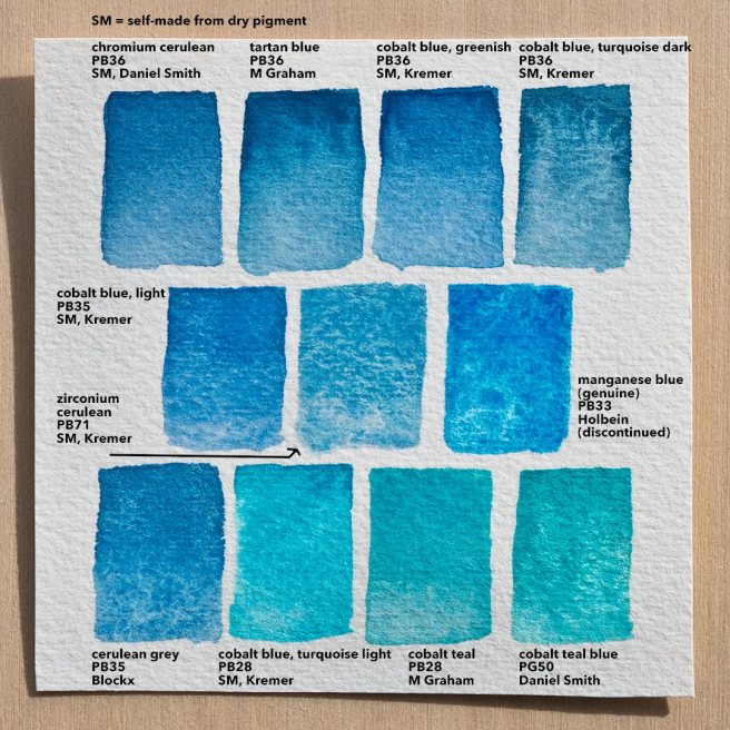
In the chart above zirconium blue is in the center, surrounded by all of the watercolor ceruleans (both PB35 and PB36) that I have access to and also some cobalt teals that I thought would be similar, plus manganese blue. The tartan blue was a limited edition variety of cerulean that I don’t think is made anymore, and the pigment for manganese blue isn’t made anymore either.

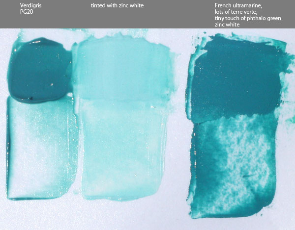
Zirconium blue is basically a heavily granulating turquoise or greenish teal. Some of the ceruleans and cobalt teals granulate more than others, but zirconium blue is only matched by genuine manganese blue. It seems to be a bit weaker tinting than the other paints here. The lifting is partly affected by the medium used to make the paint, but what I made here does lift very well, as does the “cobalt blue light” (actually cerulean) seen at the center left and the cerulean grey from Blockx in the bottom left.

The medium that I used to make each of the self-made paints was an experiment. Each time I make watercolor medium it’s a little different to explore how changes in proportions affect the paint. This time I used 5.5 grams of gum arabic powder dissolved into about 12-13ml of water that was heated to 140-150°F (60-65°C). Then about 2-3ml of light colored honey and 1-2ml of glycerin was added, which is less of both of those than I normally use. After shaking it gently but thoroughly 4 drops of synthetic ox gall from QoR were added. As a preservative I dipped the end of a brush handle into a bottle of clove oil, getting just a thin coating of it on the tip, and I put that into the medium. So far the medium seems to be working well. All of the self-made paints were just made justing a palette knife to combine the pigment with medium. Update- the paint was a little dry, so I approximately doubled the amount of glycerin.

Verdigris Part 2: Oil Paint and Matching

Verdigris 5

After my first verdigris post I made some more pigment and now I finally got around to making some proper oil paint with that, seen on the left of the image above. This was made with poppyseed oil and it was very easy to mull, requiring almost no effort. The finished paint is a really nice turquoise that’s extremely transparent and has extremely low tinting strength. I used a 1:1 mix with zinc white to tint it and it was still very strongly affected even by zinc white, so glazing seems to be the best use for this pigment in oil.

As I mentioned before, almost no one at all presently sells verdigris as either a dry pigment or as a paint of any kind, even though for a couple thousand years it was among the most vivid greens available. A big reason for that is the mix I made on the right side of the image above. Verdigris is moderately toxic and well known to have problems with lightfastness, but the mix I made using only lightfast, non-toxic, and inexpensive paints is nearly a perfect match. I used a lot of terre verte (hoping it’d lend transparency and low tinting strength), french ultramarine, a very small touch of phthalo green to increase the chroma, and zinc white (again hoping for transparency).

The mix isn’t as transparent and has far higher tinting strength, even though I used so much terre verte. Plus, the mix was only intended to match verdigris. Exceeding its chroma with the same hue is very easy with modern pigments, and the high transparency could probably be matched by adding some painting medium to the mix.

In conclusion, my curiosity of what this historical pigment was like has been satisfied and I can now say that it really is an obsolete pigment. It was fun and interesting to make, but there is really nothing that it would offer today that isn’t done better by modern pigments.

Verdigris 4

Here’s a photo of the second batch of pigment that I made in the copper dish, again using white vinegar. I tried using a different kind of vinegar, I think rice, in a separate dish but it only had a minimal development of verdigris and didn’t look any different.

UPDATE

Verdigris 6

Left: Verdigris mixed with cadmium yellow pale (Winsor & Newton, about 15 year old tube)
Right: the same cadmium yellow mixed with blues and greens to approximately match the mixture on the left, as a control sample
Photographed after 48 hours.

As you can see, the verdigris appears to have darkened significantly. I believe it’s in reaction to the sulphur in the cadmium yellow. From what I’ve read verdigris can also darken just from sulphur in the air.

Verdigris 7

For some reason the original swatch of verdigris, on the left, has also changed color in comparison to the control swatch on the right. In this case it’s more of a hue shift than a darkening though. This swatch was made a little less than 4 days ago.

So my experiment with making verdigris probably didn’t make the purest or highest quality pigment possible, and there’s obviously things that I don’t know about chemistry, but what I’ve seen has reinforced my opinion that this historical pigment is obsolete when I consider that I have never seen paint change like this before.

Genuine Terracotta Oil Paint

Terracotta Oil Paint 5

Here’s some oil paint that I made from a shard of a broken terracotta pot. Some paint brands like to sell a paint called terracotta, but here I now have the real thing. Genuine broken pot paint. 🙂

I photographed all of this in the afternoon sun. The tints are with titanium white, but I didn’t try too hard to make it exactly even ratios this time. The other two paints in the photo are just there for comparison.

It actually does make sense to do this when you consider what natural red ochres and synthetic mars reds are made of. Basically, red ochre is primarily colored by iron oxides and, depending on the source, also contains large amounts of things like clay, quartz, gypsum, etc. Mars red is made through chemical reactions using ingredients like powdered iron and is baked at high temperatures. A mars red is very similar to a natural red earth but without the mineral impurities. To make a terracotta pot (or red bricks) that mars red is then mixed with things like clay. So, as I’m understanding it, a powdered terracotta pot really isn’t much different from a natural red ochre.

All I used was this one small shard of the pot. Before now I had actually been putting the pieces into the bottoms of other pots to improve the drainage. To grind it into powder I switched back to my old granite mortar and pestle. It actually broke down a lot easier than I expected, and I only ended up using a about a third of the powder.

To make it into paint I mulled the powder with a mix of linseed and poppyseed oils. Of all the drying oils used to make oil paint for artists, linseed oil has the highest percent of linolenic acid. It dries the fastest and makes the strongest paint film, but it also yellows the most over time. Poppyseed oil has little if any linolenic acid, but one of the highest percentages of linoleic acid. It’s one of the slowest to dry and doesn’t make as strong of a film, but has a lighter color to begin with and is supposed to not yellow nearly as much. That’s why some brands specifically use it for very light colors such as white, where even a small amount of yellowing would be noticeable. The mix of the two oils should produce a paint with a stronger film than just poppyseed and that doesn’t yellow as much as linseed with a drying time between the two. Some brands of paint do also mix oils for reasons like that. Mostly though I did the mix because I’m running low on linseed oil but I have plenty of poppyseed. 🙂

Verdigris Pigment: Making Green From Copper – part 1

Verdigris 2

The photo above is verdigris pigment, PG20, that I made in a copper dish. The scratches were made with a stone to reveal the color.

The name verdigris comes from the French name for “green of Greece,” which is made from copper corrosion. It’s poisonous and from what I’ve read has problems with permanence and other issues, such as damaging paper, but from ancient times until the 19th century it was the most intense green available. Today it’s very rare to see anyone selling it, so yesterday afternoon I started this experiment to make my own.

This was done with a sheet of copper that I cut into a small circle and then hammered into a bowl shape. After that I poured into it a small amount of white vinegar for its acetic acid content. Apparently different vinegars will produce different greens, but this is the only one I’ve tried so far. I had read that a little salt is suppose to help, though I don’t know the specifics, so I also sprinkled in a little sea salt. Then I just left the dish in the sun. As it evaporated I could see a rim of dark green forming around the edge of the vinegar. I forgot to check it this morning, but when I looked in the afternoon everything had evaporated. There was still a bit of a vinegar smell though, and I don’t know if I should have waited longer before collecting the pigment.

Verdigris 3

Looking closely, the bottom of the dish had many green crystals on it. They were easy to scrap off and crush with a palette knife. I also poured in some more vinegar to see if more would form tomorrow, but in the course of making this post it already evaporated and it looks like there is more green in the dish already. Again though, I don’t know if I should let it sit longer.

Verdigris 1

I made a small amount of watercolor with that pigment, just using a palette knife, and then mixed it with lemon ochre in steps to see what it’d look like. The photo shows the paint a little lighter than it really is, but the hue and intensity are pretty close. Looking at the paint from different angles shows a lot of metallic glitter. Maybe that’s copper that didn’t fully corrode?

For the next part of this experiment I’ll get enough pigment to make some oil paint with it. Then I’ll try a different method in which the copper is placed in a jar with some vinegar in the bottom and left in the sun for a month as the vapor from it fills the jar and forms verdigris crystals on the copper. 🙂

Lapis Lazuli and Red Jasper Watercolors

Lately I’ve been experimenting with grinding various stones into powder and then making watercolor from that. Some of the stones I found myself but here’s two that I bought.

Lapis Lazuli Pigment

I’ve had this tiny piece of lapis lazuli for many years. The actual process of extracting lazurite from this is more than just hitting it with a hammer. From what I’ve read it involves oils and clay that’s used to remove impurities like pyrite and clear minerals, but I don’t have all the needed materials and my piece is so small that there wouldn’t be enough pure pigment for me to make paint. Therefor the impurities are going to stay, even if only to add some bulk. Grinding this was surprisingly easy.

Lapis Lazuli Watercolor

The paint I made from it was a gentle smokey blue that’s very granulating. You can’t see it in the photo but there’s little glints of sparkle from the pyrite. If it looks a little greenish it might be because the water I was using had already been used for other paints and needed to be changed. Maybe the impurities are a factor too.

Lapis Lazuli Pan

That little stone ended up being just enough for a full pan of watercolor. Some of the paint swatches it’s sitting on are from store bought tubes and some I made myself from dry pigment I bought, but there’s a few in the top right corner that were made from stones I found. These swatches are all from me trying to figure out which colors I want to include in my new travel case.

Red Jasper Pigment

This is red jasper that I mail ordered. It was completely different to grind because it was so much harder. The card that came with it said it was a hardness of 6.7. I don’t know the hardness of any of the other stones I’ve found but none were as hard to grind at this one.

The pigment was a little duller than the stone itself. A lot of pigments become lighter and duller as they’re ground more finely. The lapis lazuli was the same way.

Red Jasper Watercolor

Here’s the finished red jasper paint. It’s not as red as I was originally hoping, more of a brown, and still a little gritty. It has a nice granulation though and a good amount of darkness and opacity to the paint at full strength. Maybe someday I’ll order some yellow jasper.

There’s a lot of other stones that I’ve tried turning into paint and I still have more to experiment with, but I thought these were two of the more successful ones.

Clouds and Waves (finished)

Clouds and Waves Finished

Oil on canvas, 5″ x 7″

Somehow the paint from yesterday evening was already nearly dry this morning. I know burnt umber dries fast but I’m wondering if the marble dust I mixed into the acrylic ground absorbed some of the oil out of the paint.

It’s afternoon now and I decided to glaze over it with a mix of putty (linseed stand oil, walnut oil, marble dust), some more of the burnt umber I made, and then from Daniel Smith I used some transparent blender, genuine lapis lazuli, and zinc white. The lapis lazuli looks good out of the tube but is such a weak paint that it just doesn’t live up to its marketing hype. It’s fairly good at glazing though. I don’t normally do glazing but I like how this worked.

Clouds and Waves

Clouds and Waves

Oil on canvas, 5″ x 7″

Sun setting behind low clouds while waves beat on the rocks.

I painted this using three oil paints that I made recently. The reddish brown I made today using Italian Burnt Umber Warm pigment from Natural Pigments. The black is Iron Oxide Black 306 Bluish, from Kremer Pigments. I also used a little bit of a violet earth pigment, Augite Porphyry Violet Light from Agulis Pigments, but it was mostly covered by the black at the top. The light areas are just the burnt umber scrubbed on thin and then scraped off.

I was using a stiff brush, a Titanium #4 bright from Robert Simmons, which has some dried paint in the bristles to make it extra stiff. It’s one of my favorite brushes.

Before starting this I wanted to smooth the texture of the canvas a little, but for some reason I still haven’t gotten any gesso since I ran out a long time ago. Instead, I took some clear acrylic gel medium and mixed marble dust into it. Then I spread it over this canvas board with a plastic palette knife. It seems to have worked perfectly. The deep gaps between the canvas weave were mostly filled in but there’s still enough tooth that it held the paint well enough.

The burnt umber also has some marble dust in it as an experiment. 🙂

Dusk

Dusk

Watercolor on paper, 7″ x 5″

A simple scene of two eagles flying home at the end of a day. The composition is based on a closeup of an old man’s beard from a painting by Rembrandt.

I painted this with the anthracite (coal) watercolor that I made in my last post. It turns out that it’s actually so inert when applied to wet paper that even the brush strokes were easily retained as I painted the two main mountains, which is interesting because it gives me additional texture options. I really like this paint.

When I get some more empty tubes I’ll grind up the rest of the anthracite and make a full tube of it in watercolor. The dried paint I made before seems a little hard to rewet, so I think it’ll be best to have it stored as wet paint in a tube. I briefly tried making a little bit of oil paint with the same pigment today but it seems like it’d be more useful as watercolor because its strong texture can be seen.

Anthracite Coal Watercolor

Anthracite Watercolor Swatches

When I was looking for interesting rocks at a local rock shop to grind into pigment I found a piece of anthracite. I knew various forms of coal or related materials could be made into paint, so I thought I’d try it. I don’t know what the lightfastness of this is, but it’s probably not very good. Even so, I really like this slightly brownish black watercolor paint.

The wet on wet swatch is my favorite because it was so inert in the water that it easily retained interesting visual textures. In the light wash you can see that there’s a few very tiny loose particles in the paint. I just wiped one of them off the paper, so maybe I needed to mull the paint longer. The pigment had a little resistance to mixing with the wet ingredients, but not nearly as much as when I tried making viridian watercolor a few weeks ago.

Making Anthracite 1

Here’s the tools I used for making the pigment. The mortar and pestle are stainless steel and I only use it for grinding pigment. This is the second time I’ve used it like this. The first time I was doing this exact process but with some pieces of tiger’s eye a few weeks ago.

The goggles are obviously to protect my eyes, since little pieces of anthracite kept flying everywhere. The steel block that the anthracite is on is meant for making jewelry. I ordered it from Amazon specifically for doing this kind of thing. The hammer is 3 lb because with more weight I can move the hammer more slowly, giving me more control, and still have the same impact force.

Making Anthracite 2

The anthracite has a lot of interesting textures in it. In some places the pattern of the cracks almost looks like wood, and in other places it’s very glossy and looks like obsidian.

Making Anthracite 3

I found that tapping very lightly with the hammer was best, even though it seemed slow, because otherwise the little pieces would fly everywhere. Holding the hammer just below its head gave me more control. I found that holding my hand on one side of the block and tapping with the hammer angled toward that side helped a lot to prevent pieces from flying off the block. It’s not necessary to break it down into a fine powder at this point, a coarse powder is all that’s needed.

Making Anthracite 4

Here’s the finished pigment, ground much finer with the mortar and pestle. It turned out to not be as fine as I thought. When I actually put this under the muller to make paint it still felt pretty coarse, but it smoothed out a bit as I mulled it.

I still have most of the anthracite left, which I may grind up later and use to make oil paint.

Golden Mountains

Endless Dream 2

Oil on linen, 8″ x 10″

Gold paint for the base layer and self-made terra verte for the mountains. While I made this I thought it was interesting that I was painting a thin sheet of golden clouds over mountains by having had first painted the clouds and then draping a thin sheet of mountains over top of them. The terre verte is transparent so the golden base color is showing through everywhere and especially where the paint is thin.