Woodland Deer and the Use of References

Two Deer Among Trees
Graphite and white charcoal on grey paper, 8.5″ x 5.5″

I saw these two deer from a distance and got a few photos to use as reference material, but the photos really weren’t great for just copying as they were. Between being on a moving train, to the sky being overcast with poor lighting, and using an old manual focus lens at a distance, I’m just happy that I got anything useable. So here’s an example of using a reference photo or two just as a reference that I can adjust while drawing, rather than something to slavishly copy.

Woodland Deer 1 ref 1

To start with, the original crooked photo was cropped and edited a bit for contrast and sharpness. Then, I decided the tree on the right should be much closer in, because otherwise it wouldn’t have even been in the framing of the drawing. The viewing angle in the drawing was also lowered from the original photo so more vaguely vegetated background would be visible, because at the original angle none of the background would have appeared on the page. The far left foreground tree was added to give a little weight to that side of the drawing, hoping to help the composition, and a second deer was added so the scene would be a little less empty. The composition really wasn’t thought out as well as it should have been though.

Woodland Deer 1 ref 2

This is a crop of another photo taken a moment later after the two deer started moving away, which was when I realized that there was a second deer. I’m not sure which of these two deer was in the first photo, so I may have just drawn the same one twice. That’s a useful approach because a few photos of the same animal in different poses can be drawn later even as an entire herd.

Back when I was in school I remember feeling like drawing just from imagination was what I should always try to do, because people would always ask if I had made something “out of your head” and would always act more impressed if that was the case. The result of always doing that was things didn’t really look right, or even recognizable, because I didn’t have a good understanding of how they actually did look. That’s gained from practice and thorough study, not from just making things up based on how you think they should look.

Since then I’ve kind of gone the other direction and often feel like I can’t draw anything if I’m not looking at something. Then I often just copy what’s there. I think the real point and usefulness of reference photos is to have something that you can conveniently look at later for ideas or to see the details of how something naturally looks, but then to build a composition from that, not to just copy the references in a way that’s only transferring the image from one medium into another.
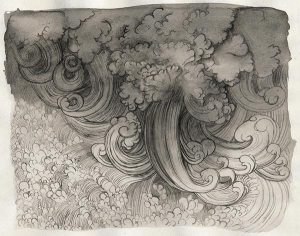
Reservoir and Trees

Reservoir with Fast Moving Trees
Black and white charcoal and graphite on grey paper, 8.5″ x 5.5″

A reservoir with a large dam, not seen, in the Rocky Mountains a little distance west of Denver. Although the reference photo I used was actually a clear view of the reservoir, in recognition of the trees that kept photobombing me as my train moved I added some in.

Draw a Bird Day – Immature Cooper’s Hawk

Immature Cooper's Hawk
Charcoal on gessoed paper, 8.5″ x 6.5″

On my morning walk I got some photos of a hawk that flew past me and landed nearby. My lens wasn’t suited for distance photos, but I got some good pose references and enough details to identify it.

There were several attempts made before this final one, but none were working well. When restarting an artwork it sometimes helps me to try a different medium. For this last one I wanted to try something different from normal, so this is sketch paper that’s been given one coat of white acrylic gesso to give it both a water resistant and slightly toothy surface. I then drew the hawk with charcoal and used a damp brush to blend or lighten it by pushing around or removing the charcoal. Normally I’m not a fan of charcoal at all as it’s a little messy to use, but this is worth doing again.

Cooper's Hawk ref

This is a small crop of the photo, enlarged 200%.

Black Chinned Hummingbird

Hummingbird on Branch
Acrylic on 60lb sketch paper, 9.5″ x 13″

This little hummingbird has posed for photos many times as I go for walks through a nearby field. Most of the final painting is made with ivory black, zinc white, and titanium white, but some carbon black and a little water soluble graphite were also used.

Black Chinned Hummingbird ref

I don’t have a very long range lens, and he’s very small, so to get a closeup photo for a reference I combined an old manual focus Minolta 200mm f4 lens with an old Vivitar 2x teleconverter. The teleconverter really reduces image quality, but for the purpose of a reference photo it worked out.

Waterfall Book 21

Birds at a Fountain
Mixed media on paper, 7″ x 5″

This week it’s a different sort of waterfall. Originally it was just going to be ink and maybe graphite, but to correct various mistakes several other media were introduced. It didn’t really work very well, but I still like the idea. There’s only four more of these left now.

Waterfall Book 17

Waterfall Underwater
Graphite on paper, 7″ x 5″

This is probably the first time I’ve ever drawn the effect of a waterfall underwater. An unexpected challenge was on the left page, which is the back of one of the pages for last week’s linocut block print. Because the ink for that print was thick and dried to create a slight raised surface on top of the paper, the shading on the back of that page was starting to show the pattern of the print. It was like making a rubbing with a paper and crayon on top of an engraving. I solved the problem of shading that page without the print showing through by holding the page up at a corner and shading it in midair while being careful not to poke the pencil through it.

Waterfall Book 16

Linocut print of a waterfall
Linocut, 7″ x 5″

My first finished linocut prints. I got this beginner block printing set maybe a couple of years ago, but it was a little intimidating and I never went through with making a finished product until now. This is what I wanted to do for last week but I needed to practice more.

I was worried there’d only be one chance to get it right, but actually the right side block didn’t have enough ink and had to be pressed a second time. The alignment was slightly off on the second try though, and the ink coverage still isn’t solid, but it’s close enough.

With so little experience I can’t give a tutorial other than to show a few photos of the process, but there’s a very good tutorial from Catherine Cronin as a pdf link on this page over here.

The first block was used for practicing the cuts, inking it, and figuring out a style. There was a little experimentation with different colors of gouache, but the ink was working out the best so that’s all that was used in the final.

Draw a Bird Day 2

Chiffchaff in acrylic
Acrylic on paper, 8″ x 6″

It’s draw a bird day again and this time I got the acrylics out. The previous bird day effort is over here and the blog to post these here. This time the reference is from the site Paint my Photo, here. There’s so many useful reference photos there that maybe I’ll start a new weekly series with an animal theme.

At first I was painting this just as black lines with watercolor on sketch paper, but copying the reference freehand was a little hard to get every line and proportion right on the first try. So, I painted over everything with neutral grey acrylic and then proceeded with just that grey, ivory black, and some student grade titanium white using the same brush. The paper wrinkled a bit, but it worked fine.

Chiffchaff in acrylic and brush

Here’s the brush, a 1″ Loew-Cornell 7550 wash. It looks like it’d be too big, but it actually worked great using the corners for details. For example, having one color on one corner and a different color on the other corner allows for fast switching between the two. Also, with just a little extra pressure the weight of the stroke can be greatly increased. Flat brushes are surprisingly versatile.