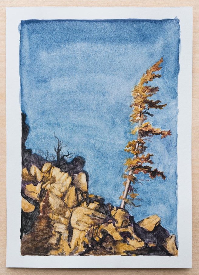
For the paintings this week I used a limited palette of five paints – genuine turquoise, raw sienna, Minnesota pipestone, and black hematite – which I’ll post at the end here.
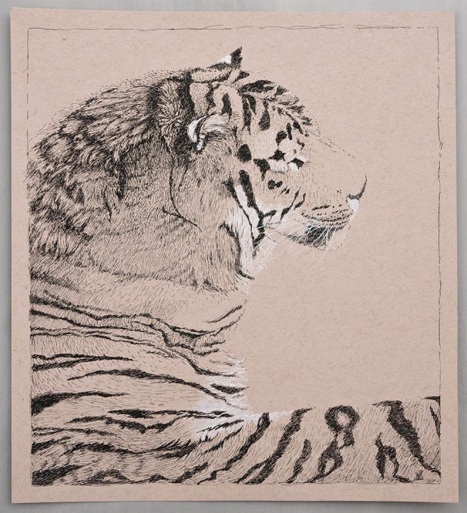
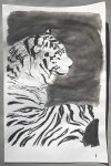
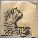
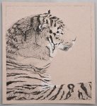
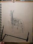
This painting above was the second attempt because the first was an experiment that didn’t work well. I originally drew this on heavy printmaking paper and then decided to try covering it all with transparent watercolor ground before painting over it. The paint lifted off the transparent ground too easily, behaved differently in areas where the ground was a little thicker, and just didn’t feel the same as paper.
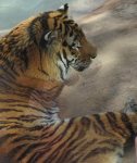
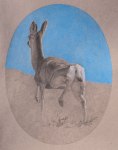
It would have still worked though, but I had tried painting it much darker so it’d look like it was lit by a candle or fireplace, and that was didn’t look as good as I wanted. There were a few other problems too, like the expression not being right. So after finishing that first try I started over and made it again. This one is on normal, good watercolor paper from Twinrocker. The reference photo is from Pauline Govaert on Paint my Photo.
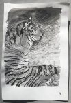
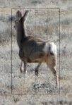
The week started with this painting. The sky was a challenge to get right because the palette didn’t have a normal blue. The turquoise was very greenish, and since my color vision isn’t very good with greens and reds it was hard to get the right balance of manganese violet added into it to cancel out the green without going too far into violet.
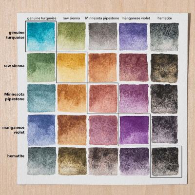
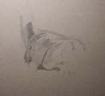
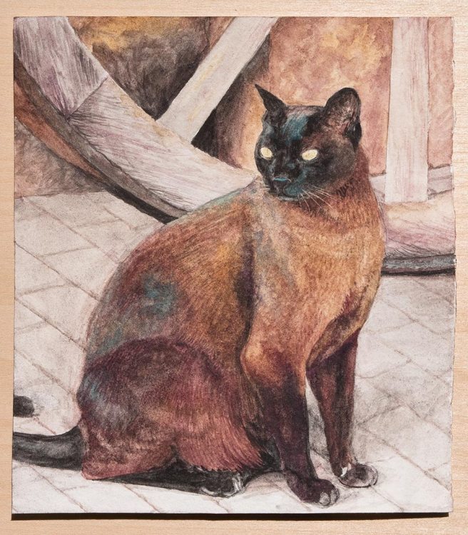
Turquoise is a color that I really like but almost never use, so I wanted to make a point of including it and as a challenge to not have a normal blue to fall back on. Looking around there’s not much turquoise, except maybe distant mountains, so it seems mostly for mixing. The pipestone is like a red ochre, but a bit weaker and more pinkish. I didn’t use it that much, but it did make a good grey with the turquoise. Manganese violet is the one paint here that I made myself from dry pigment. It turned out to be very useful, especially for mixing with the raw sienna for a range of reddish browns. The cat is mostly just those two colors mixed, plus some hematite in the darkest areas.
The chart was posted here on my Instagram last Sunday, which is when the weekly palette for most weeks from here on will be posted.