Grand Tetons and Clouds

Mountains and Clouds
Oil on canvas, 9″ x 12″

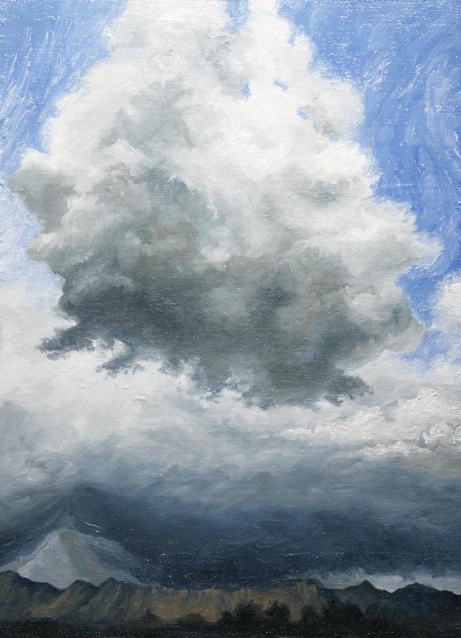
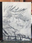
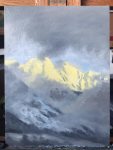
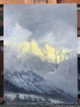
Finally a new post. I’ve been active on Instagram but haven’t felt like I had something substantial enough to put here. This new painting was an experiment using oil paint on a watercolor canvas because I liked its fine weave. The photo reference is from Nancy Winn on Paint my Photo.

I think the package said it was acrylic primed for all media, but to be sure that it was sealed well enough for oil paint I applied an extra coat of gesso. Mixed in with that gesso was a little grey acrylic paint that was leftover from an attempt at a different painting. Immediately after I roughly sketched the scene with diluted black acrylic and a small synthetic dagger brush.

Before beginning with oil paint I let acrylic gesso dry for at least four hours, or until it’s no longer cool to the touch, to be sure that it’s finished whatever mysterious chemical processes are happening as it dries. Since it was late, this was left overnight before starting the next day.

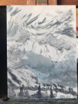
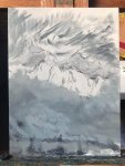
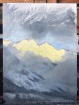
I tried roughly blocking in different areas slowly and at the same time so I’d be able to see how their color was affecting each other. Adjustments needed to be made, such as the lower clouds needing more warmth in their subtle highlights and the sky just not actually having the faint blue that I originally put there. I guess it was a diffuse warm light from a cloud behind the mountains rather than seeing all the way through to the sky. That’s the sort of thing you may not notice at first and at a glance until you’re actually painting a scene and purposefully examining each component of it, so I had just assumed the gap in the clouds was showing all the way through.

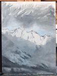
This watercolor canvas turned out to be really nice to paint on. It has enough texture that it’s not a slick surface the way some gesso boards can be, but it’s fine enough to allow for much more control of details and for the paint to glide across it more smoothly than it would on a heavier weave canvas. I wouldn’t say the quality control is especially high though, since there’s a lot of little knots and dents in the canvas, but it was good to work on.

If you haven’t check out my Instagram, here, there’s a lot of sketches and paintings there that aren’t posted on this blog.

Cloud Study 1

Passing Clouds
Acrylic on bristol board, 6″ x 8.75″

Like these clouds, time keeps passing by and the year is nearly at its end. In the time left, lets all put in dedicated effort to reach important goals. As Psalm 126:5 says, “They that sow in tears shall reap in joy.” The work described there isn’t easy and doesn’t show immediate signs of success, but it’s only if we make the effort now that good may later come of it.

Of course this doesn’t just apply to farming or other business. In a spiritual sense, the Bible also compares the Word of God to seed that is sown in the ground, representing people. Not only do the laborers share in the joy of the harvest that comes from that, but Jesus is described as taking part in that harvest. He sowed in tears but will reap in joy. The psalm ends with the next verse, saying “He that goes forth weeping, bearing precious seed, shall doubtless come again with rejoicing, bringing his sheaves with him.”

The reference was a couple of photos I took in the nearby field, but with the few houses by the trees and the highway and airport beyond that left out.

Included in the photos are each paint and the two brushes I used at the time that I started using it. The final photo doesn’t really look as good as in person, but the sun sets early now and in poor lighting a good photo is hard to get. The labels are hard to read, but the paints in order are Australian blue gum (a blue grey mix), ivory black, titanium white, cobalt blue, gel medium, cadmium orange hue (warming the cloud highlights and used in mountains), naples yellow, and cadmium yellow light.

Distant Clouds

Passing Storm
Oil on linen, 8″ x 10″

To use some of the extra paint from my last post about genuine Van Dyke brown and similar pigments I made this study of clouds in the distance moving away.

To start with I had already mixed into one blob of paint the three paints I made – bitumen, Van Dyke brown, and coal. To that was added the two natural Van Dyke brown / Cassel earth paints from Williamsburg, plus some Rublev raw umber and charcoal black to help it dry, and also a generous amount of putty medium made from marble dust and chalk. This resulted in a transparent blackish brown paint with a lot of character. I made two piles of paint and added a very small amount of ultramarine blue to them both, with a little more in one than the other.

Forming the basic shapes of the clouds was done by increasing the thickness of the paint to make it darker, brushing harder or adding more putty medium to make it thinner and lighter, switching between the two piles of paint to get warmer or cooler greys, or adding some zinc white to both lighten and slightly increase opacity. Titanium white was then mixed into the wet paint to model the lighter or more opaque parts of the clouds. The sky was the same base paint with even more ultramarine and some white, brushed thinly, and the reddish clouds at the bottom had a very small amount of Williamsburg’s Italian Pompeii red (a bright red ochre) mixed in.

This was painted on Friday nearly all alla prima (painted at once, without letting it dry) except for a few adjustments this morning to a small area that was standing out too much and distracting.

Advancing Clouds

Large cloud over a field
Oil on paper, 5″ x 7″

This study painting is the same view as the last post, but on a different day and with a wider lens. The final version here is made with oil paint on paper that was sealed with acrylics. The paints used were Williamsburg ultramarine, Rublev Cyprus raw umber medium, Daniel Smith zinc white, and a special white paint that I made myself. The reference photo is probably about three photos stitched together with Photoshop.

Advancing Clouds - ref

I started by making this as another acrylic painting on the same printmaking paper as last time. It seemed to go well, or I wanted it to, but while working I kept brushing aside thoughts that it looked too sloppy. When I finally photographed it and compared it with the reference photo it was obvious what a mess it really was.

Acrylic on paper, 9.25" x 6.25"
Acrylic on paper, 9.25″ x 6.25″

That was a little discouraging, but I started thinking that besides the messy brushstrokes the whole scene wasn’t working either. The nearest cloud is where the focus should be but it didn’t have enough of a sense of really approaching toward the viewer the way it was in person. After experimenting a little with cropping the scene on my computer I decided to try cropping and repainting the same paper.

First, the acrylic paints had warped the paper, and I wanted a flat surface to work. To smooth it out I brushed a mix of PVA glue and water onto a small piece of mat board, placed that onto the back of the paper where I wanted to crop it, then flipped it back over and used a roller brayer to smooth everything and also press the paper firmly onto the mat board. Nearly all of the warping was gone. All that was left was to trim away the excess paper and brush clear acrylic gesso over everything to give the oil paint a better surface to hold on to. Not much gesso was needed because the acrylic paint had already sealed most of the surface, except a little at the top and bottom, making it safe to use oil paint without oil leeching into the paper. The acrylic painting showed through the clear gesso and gave a guide for the oil paint.

Table Mountain Sunset

Sunset over Table Mountain, Cape Town
Casein on bristol board 8.5″ x 5.5″

The water was the most difficult part of this because I was in a rush and it seemed like nothing I did got the color right. This was painted entirely with a da Vinci CosmoTop spin pointed filbert, size 8. Photo reference from Louise Petrick of Paint my Photo.

Also, there was a notice today that I signed up for WordPress 6 years ago today. My first actual post was in July, 5 years ago, and I don’t remember there being a long period of not posting after signing up, but that’s what the notice claims.

Wedge Island Sunset

Western Australia Sunset
Gouache on watercolor paper, 7″ x 5″

A sunset to end the week with. The reference for this is also from Paint My Photo, here. The photo is from an album of Wedge Island photos, which is off the western coast of Australia, so that must be the Indian Ocean there.

This week has probably had the longest posting streak ever on this blog with six days in a row for my timezone. I won’t be posting anything tomorrow, which is Saturday, though because it’s the Sabbath and I rest and devote that time to God in accordance with the fourth commandment. It’s a great blessing to rest and turn your attention to spiritual things for a day out of each week. Afterwards the next week can then be started refreshed both physically and spiritually. Because the fourth commandment specifies the seventh day and explains that it’s in memory of creation, when God blessed the seventh day, I believe it’s important to rest on this day.

Mountains, Trees, and Clouds

Mountains, Trees, and Clouds

Oil on canvas, 7″ x 5″

I’ve been painting in oils again lately. Yesterday I scraped together a lot of different colors that were on my palette and mixed them into one blob. Some of them I was using on a couple of other paintings, and some were just to see what they’d look like if I mixed them. Today I didn’t have a plan but I started using that mixed paint and some white on top of an old painting until it started to look like clouds, so it became this. It’s just a quick painting, but the clouds were fun to paint. I’m not sure how else I feel about this.

Mountains, Trees, and Clouds detail

I painted the clouds thickly but the brushstrokes and texture of the paint can’t be seen in the full image, so here’s a detail view of the clouds that are a little to the right of the center.

Mountains and Clouds

Mountains and Clouds 3a

Here’s a few iPad drawings I had made a couple of weeks ago. Above is the third and final drawing of these three. Originally I was going to have ibexes in the foreground like in the two sketches before it, but it wasn’t working like I wanted in this final one and I redesigned it to have birds flying.

Mountains and Clouds 1a

This was the first drawing I made with the Tayasui Sketches app, and at this point I was just using my finger to draw.

Mountains and Clouds 2a

For this second drawing I used a stylus. I like it, but it’s kind of a boring composition, so after this I started the final drawing that I posted at the top.

After the Thunderstorm, after Arkhip Kuindzhi

After the Thunderstorm

Oil on canvas, 10″ x 8″

I made a rough copy of a painting by Arkhip Kuindzhi.

The blue is a mix of ultramarine that I made myself with some titanium white and a little transparent red oxide for the areas with more grey. I used a few drops of burnt plate oil when making it, which is linseed oil that’s been heated to the point of combustion and left like that until half the volume is left. Adjustments to the amount of heat and length of time produces a range of different results. It’s thick and normally used in printmaking, but I read a theory that Rembrandt (who was also a printmaker) may have added some of it to his paint to get the effects he did. The paint I made was very interesting and could be called stringy or ropey. Very different from normal ultramarine from a tube.

Passing Storm

Passing Storm

Watercolor and gouache on paper, 14.5″ x 5.5″

It’s been raining a lot lately. We still need more rain because of the drought, but this has been very good so far.

I started this with a very different landscape idea, but I was painting with too much reservation and on a different paper that I wasn’t familiar with, so it was wasn’t working well. Then I stopped hesitating and began covering the paper in black paint until I got a different idea, turned it upside down, and it became this. Although it’s still small, I think this is the biggest watercolor painting I’ve made in a very long time. I mostly used charcoal black and lamp black.

I really like this wide format, but to post it here I have to shrink it too much, so click the image for a larger view.