Limited Palette Paintings – Waterlilies and Sunset

Sunset in Winter Mountains
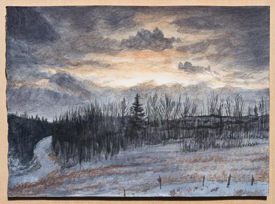
Winter Sunset, watercolor on paper, 7.25″ x 5.25″

This past week I’ve been using a palette with a little more spring potential, with the inclusion of chromium oxide green, but I also wanted to paint some clouds too. This painting above is from a photo I took last winter in the Rocky Mountains.

It was a snowy landscape with little light from the overcast sky late in the day, but then the clouds started to slowly part enough for sunlit clouds to be seen through them in a long rift. Thinking about it now reminds me of this quote I’ve read- “When Satan thrusts his threatenings upon you, turn from them, and comfort your soul with the promises of God. The cloud may be dark in itself, but when filled with the light of heaven, it turns to the brightness of gold; for the glory of God rests upon it.” -Ellen White
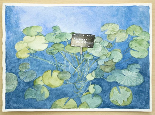
Waterlilies, watercolor on paper, 7″ x 5″

Because of the green on the palette I made sure to also paint some plants. This waterlily was painted from a photo I took at the Denver Botanic Gardens. It’s called Black Princess, and apparently has blackish red flowers when they’re blooming.
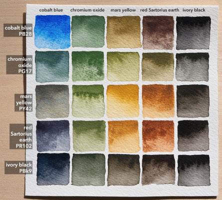
For the palette this week cobalt blue was a very good, strong blue, but granulated a little too much to get the smoothness of the water. It made nice greys when mixed with the red earth, which was otherwise not used much. The real stand out was the chromium oxide, which is the one that I made myself from dry pigment. It’s very strong and also opaque. About 12 of the 25 mixes above are green because so many of these are either green or combine to make green. Ivory black actually wasn’t used very much, except in the trees of the sunset painting, but I wanted the option of something darker than the grey made from mixing cobalt blue and the red earth.
Evening Train in Mountains

Mountain Train at Sunset
Watercolor on 300 lb paper, 4.75″ x 7″

This scene is based on a photo I took in the mountains, but it’s not the exact original scene. I drew it from memory without actually looking at the photo, so some of it is different and the rocks are definitely more monumental in this painting. The palette is the same one from last post, seen on Instagram here. This time all six of the paints were used, though mostly all mixed together for the shadows.

Evening Train in Mountains 1 linework

Desert Sunset

Thin Red and Gold Sunset
Conte crayon and pastel pencil on grey paper, 8.5″ x 5.5″

I don’t think I posted the photo for this before, but it was taken five years ago while on a train crossing the desert. Probably somewhere in Nevada, looking back while traveling east.

Desert Sunset 1 ref

This past week I also worked on a couple of large drawings, one of which I posted on Instagram here.

Restless Sea

Restless Sea
Watercolor, gouache, and casein on 300 lb paper, 4.25″ x 7.5″

I happened to look at the recent painting Fading Quietude upside down and thought it looked very much like either a sea with rocks or a mountain scene with foggy clouds. So I reimagined that same upside down composition as this seascape.

Friday is nearly over, the sun is setting, and it’s almost time for my own Sabbath rest, but the world at large, like this sea, doesn’t look like it’s going to rest anytime soon.

The paints are the same as before. The white in the small plastic container is the casein titanium white, which I’ve found works far better than either watercolor or gouache whites, as those both significantly lose opacity as they dry.

For brushes I started with a small ox hair flat from Daniel Smith, but found that I needed a stiffer brush for this paper. This is old paper and I think the sizing on it got too old to work well, causing it to absorb water too fast. A stiff synthetic brush is more usable even if the water is sucked out of it because it doesn’t get floppy like a natural brush. Most of the basic shapes were then finished with a Hwa Hong synthetic filbert brush with much stiffer hairs, especially because it’s difficult to fully rinse out and some old acrylic paint had dried in it. The finer details and color adjustments were finished with a small Robert Simmons titanium round.

Fading Quietude

Ebbing Tranquility
Gouache, watercolor, and casein on marker paper, 4.25″ x 7.5″

For most of you August has already arrived, but for me it’s still the end of the last evening of July. It’s been a very eventful month for many people and the whole world is sliding further into strife, in one form or another. Because we don’t have endless more months available to make important things wait, let’s all work hard to do well in August and to be sure that we’re right with God.

Table Mountain Sunset

Sunset over Table Mountain, Cape Town
Casein on bristol board 8.5″ x 5.5″

The water was the most difficult part of this because I was in a rush and it seemed like nothing I did got the color right. This was painted entirely with a da Vinci CosmoTop spin pointed filbert, size 8. Photo reference from Louise Petrick of Paint my Photo.

Also, there was a notice today that I signed up for WordPress 6 years ago today. My first actual post was in July, 5 years ago, and I don’t remember there being a long period of not posting after signing up, but that’s what the notice claims.

Wedge Island Sunset

Western Australia Sunset
Gouache on watercolor paper, 7″ x 5″

A sunset to end the week with. The reference for this is also from Paint My Photo, here. The photo is from an album of Wedge Island photos, which is off the western coast of Australia, so that must be the Indian Ocean there.

This week has probably had the longest posting streak ever on this blog with six days in a row for my timezone. I won’t be posting anything tomorrow, which is Saturday, though because it’s the Sabbath and I rest and devote that time to God in accordance with the fourth commandment. It’s a great blessing to rest and turn your attention to spiritual things for a day out of each week. Afterwards the next week can then be started refreshed both physically and spiritually. Because the fourth commandment specifies the seventh day and explains that it’s in memory of creation, when God blessed the seventh day, I believe it’s important to rest on this day.

Evening, after Arkhip Kuindzhi

Evening, after Arkhip Kuindzhi, color2

Evening, after Arkhip Kuindzhi, color1

Evening, after Arkhip Kuindzhi, bw

These are watercolor copies of another painting by Arkhip Kuindzhi.

From top to bottom the papers I used were block printing paper (50 lb sulphite), mat board, and regular printer paper (20 lb). Painting on papers that are not normally thought of as “watercolor paper” has been working fairly well so far, especially the block printing paper.

These papers are very inexpensive compared to normal watercolor paper, especially compared to the 300 lb paper that I used to use. Because of that and also because I made most of the paint myself for very little cost, all of my materials are very inexpensive now. Being able to freely practice without the worry of wasting expensive materials has been what I’ve always really needed.


Sorry about posting this twice. The first try was somehow posted out of order with a date ten days in the past and I wasn’t sure how else to fix it. Huh, looks like I deleted the comments too. Whoops. ^_^;

Evening Comes Fast

Evening Comes Fast

Watercolor on mat board, 5″ x 7″

This blog has been going for three and a half years now, and I really appreciate the encouragement that I’ve received even though the rate of posting has been so slow at times.

Paul in the Bible uses athletic training to make a comparison to the importance of discipline in the goal of receiving an eternal reward in heaven, not excusing himself from this, saying “But I keep under my body, and bring it into subjection: lest that by any means, when I have preached to others, I myself should be a castaway.” (1 Corinthians 9:27) Sometimes I’ve tried giving advice to other artists on the importance of practicing and trying in art despite worries of how it’ll look, but I know I haven’t been as disciplined as that myself. This isn’t good. There’s too much paint still in tubes, ink still in bottles, and graphite still trapped inside wood instead of on paper or canvas where they all belong.

I’ve finally changed the blog title from the generic one I’ve used all along to something more appropriate for what I want to do. Also I’ve been trying out options with the blog theme to make things look a little better. Does the background photo make the text hard to read?