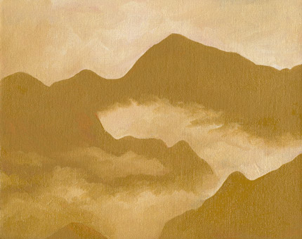
Clouded Wilderness

Clouded Wilderness

Oil on linen, 7″ x 5″

When I started this painting I didn’t have a plan for what I wanted to make. Instead, I painted shapes with yellow ochre domestic (Williamsburg) and an alkyd fast dry titanium white (Da Vinci).

As I slowly covered the canvas I thought of various ideas for what the shapes could become. It was between this or a sunset. If I had chosen a sunset I would have used the darker shapes as clouds and the lighter shapes as the sky behind them. Just to see how it would look, I started painting the shapes of mountains into the darker areas and I decided to go with that.

The linen panel I used was one I had already covered in some reddish paint, maybe Indian red or something similar, a long time ago. That color shows through a little in places where the paint is thinner or where the bristle marks cut down into the paint.

Red Sunrise

Red Sunrise

Oil on canvas, 8″ x 10″

I was looking at Yellow and Gold by Mark Rothko yesterday and I thought I’d like to paint something like it, but… I figured it could use a few mountains. 🙂

I used three recently gotten paints that I haven’t used on anything yet, plus white. Transparent yellow medium (PY128, Rembrandt), Indian yellow (PY83, Michael Harding), and pink madder (PR221, Holbein). All three of them are very transparent paints. The sky is a mix of the two yellows and the mountains are a mix of Indian yellow and pink madder. I was really impressed with the reds and oranges that I got from that. The reddest area is an extremely intense vermilion but very transparent.

It was hard getting a good photo and I ended up doing a little editing to it and combining two different photos. In the real painting the sky is a little more yellow and isn’t quite so blended together, being more bands of color. The reds of the mountains are actually not far off from how they really look, but the brushstrokes aren’t really showing up. One of these days I need to either figure out my camera better or get a better lighting setup than just going outside into the sunlight…

Mountains and Mist

Mountains and Mist

Oil on canvas, 5″ x 7″

For this painting I wanted to try out three paints I recently bought. Flake white hue (Winsor & Newton), yellow ochre (Grumbacher pre-tested) and light red (Holbein).

The white is suppose to mimic flake white, which is made with lead. Since I don’t use or have the real flake white I don’t know how good of a job this paint does at being like it, but I actually liked how it mixed with the colors. It’s a mix of titanium and zinc white that wasn’t too strong so it was easier to adjust the other colors by a small amount than when using regular titanium white. This is good for me because I prefer mixing most of my paint on the canvas instead of on the palette. If the white is too strong then I find that small adjustments are harder to make, but if it’s too weak then I end up with too much paint on the canvas. I got this from Hobby Lobby (a hobby/craft/art store chain in the US) with a 40% off coupon, so it was very inexpensive.

I was actually impressed with the yellow ochre. I haven’t bought or used anything from Grumbacher in many years and they tend to have less expensive paint compared to many other brands. I found this tube in the sale bin of another art store because its cap was crooked and it had leaked a bit of oil, so instead of their usual price of $6 I got it for $3. The paint inside the tube was perfectly fine though. It’s a mix of both natural yellow ochre and synthetic mars yellow, and its consistency is like soft butter. I would be interested in trying out another tube of their paint in the future.

The light red is one of those many different terms for both natural and synthetic red ochres. This one from Holbein is synthetic and I also found this in the sale bin. Although I do have an assortment of Holbein oil and watercolor paints I haven’t actually bought any for a long time now. The consistency is also like butter, but shorter and not quite as soft as the yellow ochre.

Mars Yellow Paintings

Click for larger size

Oil on canvas, 10″x8″

This painting is loosely based on a Chinese landscape painting I saw in a book of mine called The Jade Studio. It’s a very good book, but I don’t have it with me right now so I can’t look up any information on this painting or the others except what I had already typed. I only used mars yellow that I made myself and titanium white from M Graham.

I finally decided to try making some oil paint a couple of weeks ago with the glass muller I had gotten from Natural Pigments. So far I’ve only used it for making watercolor because I thought the cleanup after using it for oil paint would be a bit of a hassle… and it kind of was. I think the result I got was worth it though. I used mars yellow (PY42) pigment from Blue Ridge and walnut oil from M Graham. The finished paint was very soft and kind of goopy and ropey, which I like.

The only problem was that I made way too much of it. I made alla prima painting after painting with nothing but mars yellow, and sometimes white, trying to use up as much as I could.

Click for larger size

Oil on canvas, 10″x8″

This is a copy of a painting from a series of paintings by Dai Xi (1801-1860). I think it’s leaf 8 of the first album from his “Double Album of Landscapes” if I’m understanding this book right, but I don’t have the title for this exact painting. I can’t seem to find this painting online to show what the original looks like. In my version I only used mars yellow. There’s no white paint or any other paint. In the lighter areas I thinned the paint a little (or a lot) using Gamblin’s Neo Megilp, which I recently got and wanted to try out, and the white areas are completely blank canvas. This was kind of an experiment because I don’t think I’ve left parts of a canvas blank before, but it can be done in watercolor so I tried it with oil paint.

Click for larger size

Oil on canvas, 10″x8″

Another copy of a painting that I don’t know the name of from that book. It was a winter scene with a lot of snow and grey skies. This one also has blank canvas for white and thinned paint in the lighter areas. The original had some buildings too but I left them out. I think this is the only one I didn’t paint in one sitting, but I also didn’t paint over anything either so it might as well have been painted all at once.

Mars Yellow 3

Oil on canvas, 5″x7″

This isn’t based on another other painting, but I wanted to experiment with it. I already had a small canvas that I had covered in several coats of white acrylic paint to smooth out the canvas texture. I was planning on making a completely different painting on this, but I wanted to try this paint to see what kinds of brushstroke textures I could get on the smooth surface. I think it worked out well, except that for some reason even though the paint wasn’t very thick it took a long time to dry. I would have posted all of these a week ago if this had been dry but even still it’s too sticky to set on my scanner. I took a photo instead, in early evening shade, which is why the colors look different.

Twilight on Seine

Twilight on Seine

Self-made watercolor on board, 5″x7″

Another copy of a painting by Monet, original seen here, except I changed it to be a different time of day with different colors.

I’m not 100% sure what board this it, but I think it’s a gesso board meant for oil and acrylic. I found it in a stack of boards and canvases and I thought I’d try watercolor on it because it’s been a long time since I’ve done that. This was made with two paints, hansa yellow medium and ultramarine blue, and I made both of them myself. The yellow pigment I bought from Daniel Smith and the ultramarine I bought from Blue Ridge.

Normally when I make watercolor paint I only make a small amount and keep it in small plastic containers that are meant for dipping sauces, but because I have an entire pound (453g) of ultramarine pigment I thought I’d finally try making enough paint to fill a 15ml tube that I bought from Daniel Smith. I think I used about 2.5 teaspoons of pigment (about 12.3ml), as well as some gum arabic, honey, and glycerin. I’m still experimenting with different ratios of the ingredients and I wasn’t sure how much pigment would be needed to fill a tube.

Paint Tubing 1

On the left are the two paints that I used and the plastic sauce containers I keep them in. There was a little bit of extra blue because I didn’t want to overfill the tube and have it spill out, so I put it in a plastic container too. These containers are very useful because they have lids that I can write on with a black marker things like how much of each ingredient I used in that paint.

On the right is the filled tube (it still needs a label) and an empty tube. See the highlight on the empty tube, where the light bends a little and isn’t straight? There’s a slight dent there and that’s the point the tube needs to be filled to. You don’t have to fill the tube all the way, but don’t go past that point. When filling the tube with paint you’ll put it in the open bottom of the tube while holding the open end upward. I scooped the paint up with my palette knife and poured it in. Then when it’s full enough you pinch it closed, clamp down tight with the pliers, fold it, use the pliers again, and then repeat once more.

It’s been about 5 days since I did all this. I tried squirting some paint out of it just now while typing this and everything seems to have worked perfectly with no leaks and the paint is just as moist as was when I filled the tube. Once I do this a few more times to be sure I’m doing it right I might take photos of every step of the process, although it’ll be hard to hold the camera while doing everything else at the same time.

Yunshan 5

Yunshan 5

Oil on canvas, 5″x7″

I had some leftover yellow paints from a mixing test so I painted these mountains. The center mountain is nickel azo yellow (PY150). It’s a transparent paint so I painted from top to bottom each layer thicker than the last. Towards the bottom I was painting over dried layers with more paint so it’d be even darker. The lines between each layer are just little ridges of paint. At the end I added the clouds which are a mix of cerulean and cobalt turquoise. I didn’t end up using any white paint on this one, just two blues and a few yellows.

Canyon Pigment: Self-Made

A long while back I had picked up some crumbly clay-like rocks with interesting colors while passing through a nearby canyon. Since I’ve been practicing making watercolor paint from various pigments I thought I’d try making my own pigment from scratch using one of these rocks.

Canyon Sienna 1

It was very easy to break it into smaller pieces, but little bits kept flying off even though I was trying to be gentle with the hammer. I wore safety goggles for this. A larger mallet might have been useful.

Canyon Sienna 2

I worked at it with light taps from the hammer until it seemed to be a fine powder… except that it wasn’t. Scraping the powder onto notecards showed many chunks that were far from being powder.

Canyon Sienna 3

So I put it in a granite mortar and pestle that’s been around for as long as I can remember as part of the “decor.” Grinding the pigment in a stirring motion was pretty easy and all the bits broke down into powder. This will be my pigment grinder thing from now on. It was at this point that my neighbor’s cat decided to climb up onto my leg, and from there to my shoulders, while I knelt. I walked around for a minute with a parrot cat perched on my shoulder. ^_^

Canyon Sienna 4

It might have been a good thing to wash the pigment to get rid of impurities, but I’ve never washed pigment before so I’ll have to experiment with that some other time. The muller and grinding plate I’m holding up here was gotten from Natural Pigments.

Canyon Sienna 5

Before mulling, the pigment should be mixed with its binder using a palette knife. I’m using a mix of gum arabic, vegetable glycerin, and local honey. I haven’t done this enough times to have a good grasp on how much of each of these to use, but I think I’m getting better the more times I do this.

Canyon Sienna 6

The mulling process involves moving the muller in a stirring motion over the paint and takes a bit of time and effort. I kept adding more gum arabic, glycerin, and honey as I worked because it felt too stiff. At the start there was still a lot of grit in the pigment but over time it smoothed out.

Canyon Sienna 7

Here’s the finished paint. A plastic putty knife from the hardware store makes a good scrapper for getting the paint off the muller and gathering it back into a pile at the center of the plate. I did that several times while mulling.

Canyon Sienna Final 2
Click for a larger view

Here’s the paint in different applications on paper, Fabriano Artistico, 300 lb soft press. The photo was taken in full sunlight and then adjusted slightly for brightness and to reduce the over saturation in the photo. This is where I was thinking I might have needed to wash the pigment because there were a few very tiny dark particles that didn’t stick to the paper and brushed off after the paint was dry. It granulated nicely in wet on wet and was surprisingly dark when used full strength.

Overall it was a huge success. Maybe for now I’ll call it Canyon Earth? I didn’t use all of the pigment that I made and I still have other rocks with variations of color to try in the future.

Williamsburg Black Paint Assortment, Plus Lemon Ochre

It’s been awhile since I’ve done this, but over the past few months I’ve gotten various new paints from several brands in both oil and watercolor and I thought I’d make some swatches with them over the next few days.

This time I have the 1 ochre and 4 black oil paints I got from Williamsburg over the summer. Each swatch was first spread from a small blob of paint and then mixed in a roughly even mix with M Graham titanium white (PW6 + PW4). I’m pretty sure that’s the white I used. It was actually yesterday that I did these. That mix was then spread to the right of the original paint. A small amount of that was mixed again with an equal amount of white, and then again once more, for a range of increasingly lighter swatches that show the tinting strength of the paint.

All of these photos were taken today in the afternoon during overcast clouds. I can’t guarantee perfect color accuracy.

German Earth (PBk11) is natural black iron oxide. As expected of this pigment, it’s an opaque paint and a strong tinter. Williamsburg’s website describes it as “bluish” when mixed with white, but I’m really not seeing it. I’d say it’s fairly close to neutral.

Slate Black (PBk19) is actually very similar to German Earth, but less opaque. It’s apparently made from slate from Pennsylvania. Just a little bit gritty.

Davy’s Gray Deep (PBk19) is also slate from Pennsylvania but much lighter and with a warmer color. It’s very smooth and spreads surprisingly thin. I think it’d be very good at glazing. The photo doesn’t show it the best, but this was lighter than the first two in masstone. Its tinting strength is pretty low. Apparently slate comes in several colors, and as far as I can tell Williamsburg might be the only paint company that currently makes oil paint with slate. Many other brands all produce a “Davy’s Gray” of their own that is always one of various mixtures of pigments. A very unique paint.

Graphite Gray (PBk10) is made from ground graphite. It’s another unique paint that I’m glad I got. I think it looks a little lighter here than it really is because of how the light was reflecting off the paint, but this is the lightest of the four. It’s just slightly iridescent because of the graphite. I really like this one because it’s easily the bluest black paint I have.

This Lemon Ochre (PY43) is another natural iron oxide and is part of the Native Italian Earths set. I only have this one from the set. It’s a very strong earthy yellow. I really like the color a lot. Kind of gritty though.

As you can see in this closeup the vertical streaks are where tiny particles of grit were dragged along under my palette knife as I spread the paint thin. I had heard that Williamsburg’s earth pigments tended to be gritty, and at it seems least a couple of them are. While I can’t say this is a positive thing, it’s not necessarily a big deal. I mostly notice the grit in any paint from any brand, if it has any, while spreading and mixing it on my palette with a palette knife. When I’m actually brushing the paint onto a canvas I don’t really notice as much because of the different tool and surface texture.

Since I recently got some dry pigments from Natural Pigments and one of them was their version of Lemon Ochre I thought I’d make some paint myself and see how it compared. The color between the two was nearly the same, although the Williamsburg paint on the left was slightly lighter. The paint I made had a little bit higher tinting strength but I don’t have enough experience with making my own paint to know what the best proportions of oil to pigment are and I may have used too much pigment. The paint I made had a tiny bit of grit too, but noticeably much less.

Here I made an earthy green with a mix of Lemon Ochre and Graphite Gray. I really like the subtleness of it. A very natural looking green.

Just to show it, here’s what’s left of the white in the corner of my palette. Each time I get another dab of white I thoroughly wipe off my palette knife first so it doesn’t get the white messy.

Overall I really like all of these paints. My collection of black paint still doesn’t quite have all of the black pigments out there, but I’m now a lot closer to it.

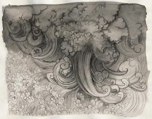
Sunny Yunshan

Watercolor on 140lb Strathmore cold press paper, 5″x7″

I used the same three watercolor paints from Rublev that I did on Landscape in Earth Colors. Each of these three paints is made from natural earth from Italy. I definitely want to get more of these, but I think I’ll need to use up some of the paint I already have before I can justify yet another order in the near future.