Verdigris Part 2: Oil Paint and Matching

Verdigris 5

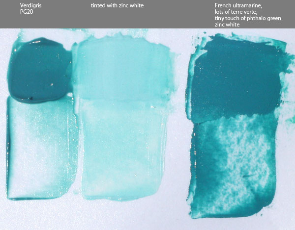
After my first verdigris post I made some more pigment and now I finally got around to making some proper oil paint with that, seen on the left of the image above. This was made with poppyseed oil and it was very easy to mull, requiring almost no effort. The finished paint is a really nice turquoise that’s extremely transparent and has extremely low tinting strength. I used a 1:1 mix with zinc white to tint it and it was still very strongly affected even by zinc white, so glazing seems to be the best use for this pigment in oil.

As I mentioned before, almost no one at all presently sells verdigris as either a dry pigment or as a paint of any kind, even though for a couple thousand years it was among the most vivid greens available. A big reason for that is the mix I made on the right side of the image above. Verdigris is moderately toxic and well known to have problems with lightfastness, but the mix I made using only lightfast, non-toxic, and inexpensive paints is nearly a perfect match. I used a lot of terre verte (hoping it’d lend transparency and low tinting strength), french ultramarine, a very small touch of phthalo green to increase the chroma, and zinc white (again hoping for transparency).

The mix isn’t as transparent and has far higher tinting strength, even though I used so much terre verte. Plus, the mix was only intended to match verdigris. Exceeding its chroma with the same hue is very easy with modern pigments, and the high transparency could probably be matched by adding some painting medium to the mix.

In conclusion, my curiosity of what this historical pigment was like has been satisfied and I can now say that it really is an obsolete pigment. It was fun and interesting to make, but there is really nothing that it would offer today that isn’t done better by modern pigments.

Verdigris 4

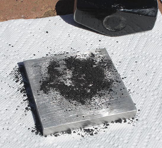
Here’s a photo of the second batch of pigment that I made in the copper dish, again using white vinegar. I tried using a different kind of vinegar, I think rice, in a separate dish but it only had a minimal development of verdigris and didn’t look any different.

UPDATE

Verdigris 6

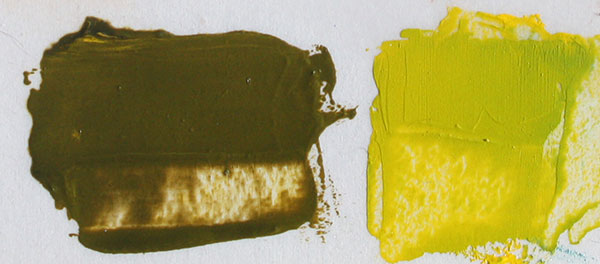
Left: Verdigris mixed with cadmium yellow pale (Winsor & Newton, about 15 year old tube)
Right: the same cadmium yellow mixed with blues and greens to approximately match the mixture on the left, as a control sample
Photographed after 48 hours.

As you can see, the verdigris appears to have darkened significantly. I believe it’s in reaction to the sulphur in the cadmium yellow. From what I’ve read verdigris can also darken just from sulphur in the air.

Verdigris 7

For some reason the original swatch of verdigris, on the left, has also changed color in comparison to the control swatch on the right. In this case it’s more of a hue shift than a darkening though. This swatch was made a little less than 4 days ago.

So my experiment with making verdigris probably didn’t make the purest or highest quality pigment possible, and there’s obviously things that I don’t know about chemistry, but what I’ve seen has reinforced my opinion that this historical pigment is obsolete when I consider that I have never seen paint change like this before.

Genuine Terracotta Oil Paint

Terracotta Oil Paint 5

Here’s some oil paint that I made from a shard of a broken terracotta pot. Some paint brands like to sell a paint called terracotta, but here I now have the real thing. Genuine broken pot paint. 🙂

I photographed all of this in the afternoon sun. The tints are with titanium white, but I didn’t try too hard to make it exactly even ratios this time. The other two paints in the photo are just there for comparison.

It actually does make sense to do this when you consider what natural red ochres and synthetic mars reds are made of. Basically, red ochre is primarily colored by iron oxides and, depending on the source, also contains large amounts of things like clay, quartz, gypsum, etc. Mars red is made through chemical reactions using ingredients like powdered iron and is baked at high temperatures. A mars red is very similar to a natural red earth but without the mineral impurities. To make a terracotta pot (or red bricks) that mars red is then mixed with things like clay. So, as I’m understanding it, a powdered terracotta pot really isn’t much different from a natural red ochre.

All I used was this one small shard of the pot. Before now I had actually been putting the pieces into the bottoms of other pots to improve the drainage. To grind it into powder I switched back to my old granite mortar and pestle. It actually broke down a lot easier than I expected, and I only ended up using a about a third of the powder.

To make it into paint I mulled the powder with a mix of linseed and poppyseed oils. Of all the drying oils used to make oil paint for artists, linseed oil has the highest percent of linolenic acid. It dries the fastest and makes the strongest paint film, but it also yellows the most over time. Poppyseed oil has little if any linolenic acid, but one of the highest percentages of linoleic acid. It’s one of the slowest to dry and doesn’t make as strong of a film, but has a lighter color to begin with and is supposed to not yellow nearly as much. That’s why some brands specifically use it for very light colors such as white, where even a small amount of yellowing would be noticeable. The mix of the two oils should produce a paint with a stronger film than just poppyseed and that doesn’t yellow as much as linseed with a drying time between the two. Some brands of paint do also mix oils for reasons like that. Mostly though I did the mix because I’m running low on linseed oil but I have plenty of poppyseed. 🙂

Verdigris Pigment: Making Green From Copper – part 1

Verdigris 2

The photo above is verdigris pigment, PG20, that I made in a copper dish. The scratches were made with a stone to reveal the color.

The name verdigris comes from the French name for “green of Greece,” which is made from copper corrosion. It’s poisonous and from what I’ve read has problems with permanence and other issues, such as damaging paper, but from ancient times until the 19th century it was the most intense green available. Today it’s very rare to see anyone selling it, so yesterday afternoon I started this experiment to make my own.

This was done with a sheet of copper that I cut into a small circle and then hammered into a bowl shape. After that I poured into it a small amount of white vinegar for its acetic acid content. Apparently different vinegars will produce different greens, but this is the only one I’ve tried so far. I had read that a little salt is suppose to help, though I don’t know the specifics, so I also sprinkled in a little sea salt. Then I just left the dish in the sun. As it evaporated I could see a rim of dark green forming around the edge of the vinegar. I forgot to check it this morning, but when I looked in the afternoon everything had evaporated. There was still a bit of a vinegar smell though, and I don’t know if I should have waited longer before collecting the pigment.

Verdigris 3

Looking closely, the bottom of the dish had many green crystals on it. They were easy to scrap off and crush with a palette knife. I also poured in some more vinegar to see if more would form tomorrow, but in the course of making this post it already evaporated and it looks like there is more green in the dish already. Again though, I don’t know if I should let it sit longer.

Verdigris 1

I made a small amount of watercolor with that pigment, just using a palette knife, and then mixed it with lemon ochre in steps to see what it’d look like. The photo shows the paint a little lighter than it really is, but the hue and intensity are pretty close. Looking at the paint from different angles shows a lot of metallic glitter. Maybe that’s copper that didn’t fully corrode?

For the next part of this experiment I’ll get enough pigment to make some oil paint with it. Then I’ll try a different method in which the copper is placed in a jar with some vinegar in the bottom and left in the sun for a month as the vapor from it fills the jar and forms verdigris crystals on the copper. 🙂

Lapis Lazuli and Red Jasper Watercolors

Lately I’ve been experimenting with grinding various stones into powder and then making watercolor from that. Some of the stones I found myself but here’s two that I bought.

Lapis Lazuli Pigment

I’ve had this tiny piece of lapis lazuli for many years. The actual process of extracting lazurite from this is more than just hitting it with a hammer. From what I’ve read it involves oils and clay that’s used to remove impurities like pyrite and clear minerals, but I don’t have all the needed materials and my piece is so small that there wouldn’t be enough pure pigment for me to make paint. Therefor the impurities are going to stay, even if only to add some bulk. Grinding this was surprisingly easy.

Lapis Lazuli Watercolor

The paint I made from it was a gentle smokey blue that’s very granulating. You can’t see it in the photo but there’s little glints of sparkle from the pyrite. If it looks a little greenish it might be because the water I was using had already been used for other paints and needed to be changed. Maybe the impurities are a factor too.

Lapis Lazuli Pan

That little stone ended up being just enough for a full pan of watercolor. Some of the paint swatches it’s sitting on are from store bought tubes and some I made myself from dry pigment I bought, but there’s a few in the top right corner that were made from stones I found. These swatches are all from me trying to figure out which colors I want to include in my new travel case.

Red Jasper Pigment

This is red jasper that I mail ordered. It was completely different to grind because it was so much harder. The card that came with it said it was a hardness of 6.7. I don’t know the hardness of any of the other stones I’ve found but none were as hard to grind at this one.

The pigment was a little duller than the stone itself. A lot of pigments become lighter and duller as they’re ground more finely. The lapis lazuli was the same way.

Red Jasper Watercolor

Here’s the finished red jasper paint. It’s not as red as I was originally hoping, more of a brown, and still a little gritty. It has a nice granulation though and a good amount of darkness and opacity to the paint at full strength. Maybe someday I’ll order some yellow jasper.

There’s a lot of other stones that I’ve tried turning into paint and I still have more to experiment with, but I thought these were two of the more successful ones.

Anthracite Coal Watercolor

Anthracite Watercolor Swatches

When I was looking for interesting rocks at a local rock shop to grind into pigment I found a piece of anthracite. I knew various forms of coal or related materials could be made into paint, so I thought I’d try it. I don’t know what the lightfastness of this is, but it’s probably not very good. Even so, I really like this slightly brownish black watercolor paint.

The wet on wet swatch is my favorite because it was so inert in the water that it easily retained interesting visual textures. In the light wash you can see that there’s a few very tiny loose particles in the paint. I just wiped one of them off the paper, so maybe I needed to mull the paint longer. The pigment had a little resistance to mixing with the wet ingredients, but not nearly as much as when I tried making viridian watercolor a few weeks ago.

Making Anthracite 1

Here’s the tools I used for making the pigment. The mortar and pestle are stainless steel and I only use it for grinding pigment. This is the second time I’ve used it like this. The first time I was doing this exact process but with some pieces of tiger’s eye a few weeks ago.

The goggles are obviously to protect my eyes, since little pieces of anthracite kept flying everywhere. The steel block that the anthracite is on is meant for making jewelry. I ordered it from Amazon specifically for doing this kind of thing. The hammer is 3 lb because with more weight I can move the hammer more slowly, giving me more control, and still have the same impact force.

Making Anthracite 2

The anthracite has a lot of interesting textures in it. In some places the pattern of the cracks almost looks like wood, and in other places it’s very glossy and looks like obsidian.

Making Anthracite 3

I found that tapping very lightly with the hammer was best, even though it seemed slow, because otherwise the little pieces would fly everywhere. Holding the hammer just below its head gave me more control. I found that holding my hand on one side of the block and tapping with the hammer angled toward that side helped a lot to prevent pieces from flying off the block. It’s not necessary to break it down into a fine powder at this point, a coarse powder is all that’s needed.

Making Anthracite 4

Here’s the finished pigment, ground much finer with the mortar and pestle. It turned out to not be as fine as I thought. When I actually put this under the muller to make paint it still felt pretty coarse, but it smoothed out a bit as I mulled it.

I still have most of the anthracite left, which I may grind up later and use to make oil paint.

Canyon Pigment: Self-Made

A long while back I had picked up some crumbly clay-like rocks with interesting colors while passing through a nearby canyon. Since I’ve been practicing making watercolor paint from various pigments I thought I’d try making my own pigment from scratch using one of these rocks.

Canyon Sienna 1

It was very easy to break it into smaller pieces, but little bits kept flying off even though I was trying to be gentle with the hammer. I wore safety goggles for this. A larger mallet might have been useful.

Canyon Sienna 2

I worked at it with light taps from the hammer until it seemed to be a fine powder… except that it wasn’t. Scraping the powder onto notecards showed many chunks that were far from being powder.

Canyon Sienna 3

So I put it in a granite mortar and pestle that’s been around for as long as I can remember as part of the “decor.” Grinding the pigment in a stirring motion was pretty easy and all the bits broke down into powder. This will be my pigment grinder thing from now on. It was at this point that my neighbor’s cat decided to climb up onto my leg, and from there to my shoulders, while I knelt. I walked around for a minute with a parrot cat perched on my shoulder. ^_^

Canyon Sienna 4

It might have been a good thing to wash the pigment to get rid of impurities, but I’ve never washed pigment before so I’ll have to experiment with that some other time. The muller and grinding plate I’m holding up here was gotten from Natural Pigments.

Canyon Sienna 5

Before mulling, the pigment should be mixed with its binder using a palette knife. I’m using a mix of gum arabic, vegetable glycerin, and local honey. I haven’t done this enough times to have a good grasp on how much of each of these to use, but I think I’m getting better the more times I do this.

Canyon Sienna 6

The mulling process involves moving the muller in a stirring motion over the paint and takes a bit of time and effort. I kept adding more gum arabic, glycerin, and honey as I worked because it felt too stiff. At the start there was still a lot of grit in the pigment but over time it smoothed out.

Canyon Sienna 7

Here’s the finished paint. A plastic putty knife from the hardware store makes a good scrapper for getting the paint off the muller and gathering it back into a pile at the center of the plate. I did that several times while mulling.

Canyon Sienna Final 2
Click for a larger view

Here’s the paint in different applications on paper, Fabriano Artistico, 300 lb soft press. The photo was taken in full sunlight and then adjusted slightly for brightness and to reduce the over saturation in the photo. This is where I was thinking I might have needed to wash the pigment because there were a few very tiny dark particles that didn’t stick to the paper and brushed off after the paint was dry. It granulated nicely in wet on wet and was surprisingly dark when used full strength.

Overall it was a huge success. Maybe for now I’ll call it Canyon Earth? I didn’t use all of the pigment that I made and I still have other rocks with variations of color to try in the future.